Automatic Layout - BidirectionalStackPanel
CODE Framework XAML components feature a new layout panel called a “BidirectionalStackPanel”. The basic idea is relatively simple and it works quite nicely in many scenarios: This panel is very similar to a regular StackPanel, except, it can stack items from “both sides” at the same time.
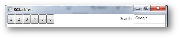
This could be a typical toolbar as you see it in a lot of apps. Buttons going across the stack from the left. Except for the last two items: The label and the search textbox need to go to the other side. So there goes the idea of using a stack panel L. But not with the Bi-Directional Stack! 😃. The above stack was created almost the same way as a normal StackPanel except I used our new control instead and I set the HorizontalAlignment property to “Right” for the last 2 controls:
<Layout:BidirectionalStackPanel Orientation="Horizontal">
  <Button Width="25">1</Button>
  <Button Width="25">2</Button>
  <Button Width="25">3</Button>
  <Button Width="25">4</Button>
  <Button Width="25">5</Button>
  <Button Width="25">6</Button>
  <Label HorizontalAlignment="Right">Search:</Label>
  <TextBox Text="Google..." HorizontalAlignment="Right" Width="100" />
</Layout:BidirectionalStackPanel>
So this is a horizontal stack. You can also do it vertical of course (which is the default, just like for a normal StackPanel). This could create an interface like this:
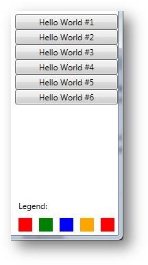
One other thing with stack panels is that often one is quite close to a usable UI, except one wants a margin between the controls. And then one is forced to set margins everywhere or create tons of style and thus the idea of creating a UI productively goes out the window. For this reason, I added a ChildItemMargin property to this special stack panel. For instance, I can set that property to “0,0,0,5” (5 pixel margin at the bottom, for each control), which changes the above UI to the following:
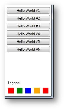
Subtle difference, but much more usable in the real world. (Note: this margin is in addition to the regular margin that can still be set on each control. So you can still set that if you want more margin. You can also set it to a minus margin if you want less margin for just one specific control. But then again: You want to stay away from setting any margin as much as you can, since it kills styling and theming).
There are a few additional features there. The BidirectionalStackPanel is actually smart about what margins to add to what controls. Often, text elements go with the next control (as they are generally labels for that control) and thus should not have as much margin. For this reason, by default, less of a margin will be added to the bottom of text controls (TextBlock and Label). Of course this can all be changed by means of (stylable) properties. In particular, take a look at the IgnoreChildItemBottomMarginForTextElements (true by default)
All of this is also completely stylable, btw. Talking about styles: CODE Framework’s SimpleEditForm style also uses the bi-directional stack as the default layout strategy. Using that, I created the following test UI:
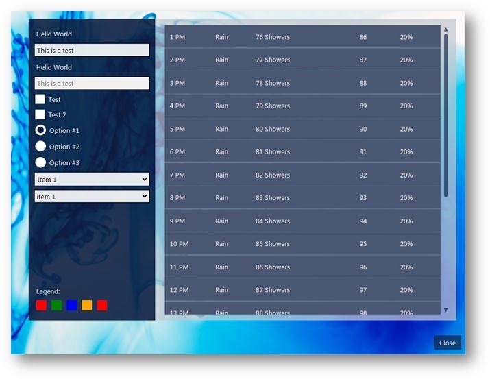
In this example, the dark part of the UI on the left is all automatically laid out by the SimpleFormLayout style (including the legend at the bottom). And yes, I could completely re-style this to look entirely different, since I did not have to code any explicitly layout into that UI.
Here’s how you use that style on a view (the view wizard does this automatically when you pick the SimpleFormStyle in the wizard):
Style="{DynamicResource CODE.Framework-Layout-SimpleFormLayout}"
Another very cool feature of the BidirectionalStackPanel is that it can automatically fill all remaining space in the panel. Consider the following UI for instance:
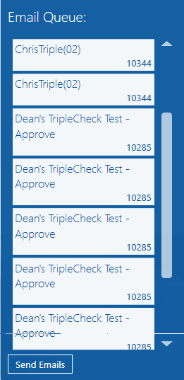
In this example, the label at the top (“Email Queue”) and the listbox are items stacked from the top and the the button at the bottom is stacked from the bottom up. The panel itself has its LastTopItemFillsSpace property set to true, so the listbox automatically uses up all available space in the panel. This is a very useful feature as it enables developers to create quite sophisticated UIs with this simple trick. (Note: There is a bit of extra space allowed below the bottom of the listbox… this is determined by means of the LastTopItemFillMargin property).
There also is a standard layout style that uses this version of the bidirectional stack panel. You can use that style like this:
Style="{DynamicResource CODE.Framework-Layout-SimpleFormToFillLayout}"