Automatic Layout - Edit Form and Elasticity
Excerpt from an internal email at EPS/CODE:
The latest version of the EditForm layout panel in the WPF portion of CODE Framework has some interesting new features. This is the automatic layout panel that can be either used directly, or it is automatically used when you use a view that is styled to use the edit form layout.
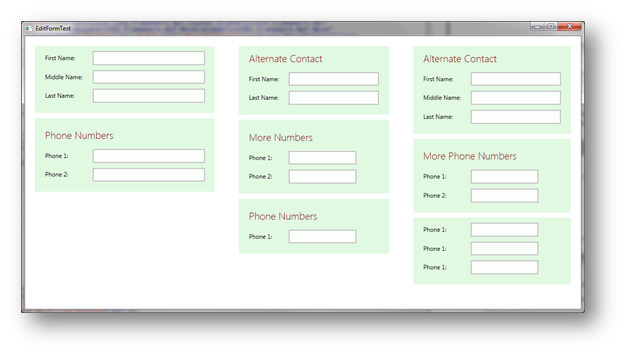
Here is an example of what this can look like:
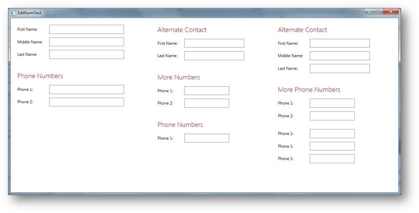
There are a few enhancements visible right there. For one, that panel now respects group titles, (which can be set on any control that is a group break or column break: mvvm:View.GroupTitle=”Hello World”).
Another enhancement is that this control now exposes a plethora of properties (which are all stylable of course). So all the spacing and margins between controls, columns, headers, groups, and so forth, can now be set. Also, fonts and colors and all that for group headers can be set. In fact, if you wanted to, you could specify a custom group header render object that does the rendering of the titles.
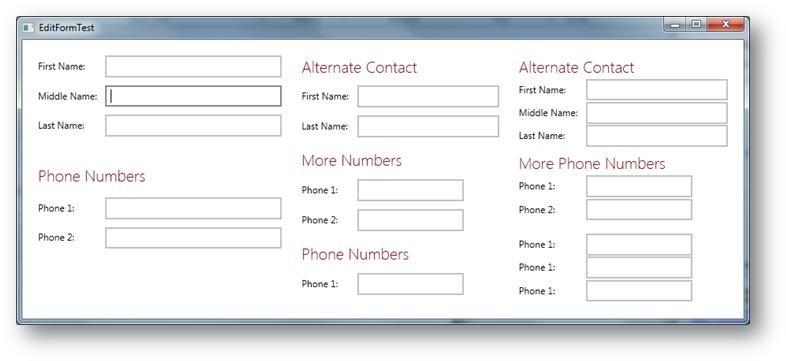
Another thing that is cool is that this control now supports two fundamental layout modes. One with the labels to the left of the edit controls (as is typical in standard Windows UIs) and one with the controls to the top (which is the Metro standard in Windows 8). Here is what happens when I change the label position to Top on the same UI:
So this now looks very much like Windows 8 Metro/WinRT. It is now also the default for our Metro style data edit forms (but this could all be changed easily by setting that style in your specific app).
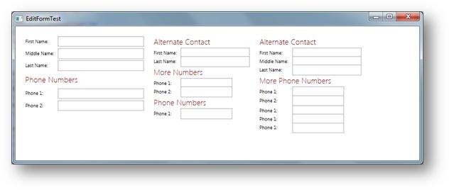
Now here is a really cool feature: What if the form gets too small to accommodate all this UI? Especially for things like the Metro style with considerable margins, this could seemingly happen easily. So I introduced a new feature called “Layout Elasticity”. This is something you can turn on and off by means of the LayoutElasticity property. The basic idea is this: If the UI gets too small, it will start to smartly shrink by reducing all the spaces and margins down to a certain minimum (there are minimum equivalent properties for all properties, so you have fine-grained control over all of this).
For instance, if I just start making the version with the labels to the left smaller, I eventually get this:
Note how much of the horizontal spacing is now gone (compare to the first screen shot) and the vertical spacing in the tallest column (on the right) is gone, the middle column has his vertical spacing reduced, and the left column still enjoys regular spacing.
This works no matter whether the label is to the left or to the top. If you try this live, you will see that it very gradually removes spacing as you keep resizing. It looks quite fluid and cool, actually.
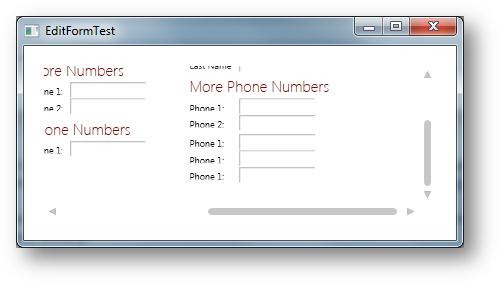
However, there is only so much you can do with spacing. Eventually, this will fail too. At that point, elasticity can go as far as scaling the UI (there are 3 settings for elasticity: None, Layout, and LayoutAndScale… the last one being the default). Here is an example of what a scaled down elastic UI looks like:
In this case, a true scale transformation was applied (it’s a bit hard to see, but this is not just a smaller version of the prior screen shot, but in this case, the content of the window only has been scaled… not that the window chrome is a the same scale as in the prior screen shot). Of course scaling also can only take you so far. There is a certain minimum scale below of which it just doesn’t make sense anymore, because people can’t read anything. You can set that minimum scale factor through a property. The default minimum is 75% (0.75d).
So what happens if all elasticity is exhausted? At that point, the only alternative is scrolling, which is also supported (and there are properties to specify whether you want that or not of course). Here’s the same UI with scrollbars:
The scrollbars are standard WPF scrollbars and thus pick up all styling of course.
BTW: The EditForm panel also supports background rendering (fill and border) for groups if you so desire:
To get this effect, set the RenderGroupBackground property to True and set properties such as GroupBackgroundBrush and GroupBorderBrush. This can be done directly in a form where you use the EditForm panel, and it can of course also be done in any stule that uses that panel.
Feature Update: A new feature has been added to the EditForm panel that allows displaying optional horizontal lines between controls. A resulting UI can look like this example:
This feature can be turned on through the following properties:
<EditForm HorizontalLineSeparatorBrush="#81FFFFFF" RenderHorizontalControlSeparatorLines="True" … />
So there you have it! BTW: here is the definition of this test UI I have been using:
<Window x:Class="CODE.Framework.Wpf.TestBench.EditFormTest"
        xmlns="http://schemas.microsoft.com/winfx/2006/xaml/presentation"
        xmlns:x="http://schemas.microsoft.com/winfx/2006/xaml"
        xmlns:Layout="clr-namespace:CODE.Framework.Wpf.Layout;assembly=CODE.Framework.Wpf"
        xmlns:Mvvm="clr-namespace:CODE.Framework.Wpf.Mvvm;assembly=CODE.Framework.Wpf.Mvvm"
        Title="EditFormTest" Height="640" Width="905" MouseDoubleClick="Window_MouseDoubleClick">
  <Window.Resources>
    <ResourceDictionary>
      <ResourceDictionary.MergedDictionaries>
        <ResourceDictionary Source="/CODE.Framework.Wpf.Theme.Metro;component/Metro-Control-TextBox.xaml"/>
        <ResourceDictionary Source="/CODE.Framework.Wpf.Theme.Metro;component/Metro-Control-ScrollBar.xaml"/>
       <ResourceDictionary Source="/CODE.Framework.Wpf.Theme.Metro;component/Colors.xaml"/>
       <ResourceDictionary Source="/CODE.Framework.Wpf.Theme.Metro;component/Fonts.xaml"/>
      </ResourceDictionary.MergedDictionaries>
      <Color x:Key="CODE.Framework-Application-ThemeColor1">DarkGray</Color>
    </ResourceDictionary>
  </Window.Resources>
  <Layout:EditForm Margin="20" x:Name="edit1"
                   GroupHeaderFontSize="20"
                   GroupHeaderFontWeight="Light"
                   GroupHeaderForegroundBrush="DarkRed"
                   GroupHeaderTopSpacing="25"
                   GroupHeaderBottomSpacing="15"
                   MinColumnSpacing="25"
                   MinEditControlLeftSpacing="10"
                   LabelPosition="Left"
                   VerticalSpacing="10"
                   ColumnSpacing="100"
                   LayoutElasticity="LayoutAndScale" >
    <TextBlock>First Name:</TextBlock>
    <TextBox Mvvm:View.WidthEx="25" />
    <TextBlock>Middle Name:</TextBlock>
    <TextBox Mvvm:View.WidthEx="25" />
    <TextBlock>Last Name:</TextBlock>
    <TextBox Mvvm:View.WidthEx="25" />
    <TextBlock Mvvm:View.GroupBreak="True" Mvvm:View.GroupTitle="Phone Numbers">Phone 1:</TextBlock>
    <TextBox Mvvm:View.WidthEx="25" />
    <TextBlock>Phone 2:</TextBlock>
    <TextBox Mvvm:View.WidthEx="25" />
    <TextBlock Mvvm:View.ColumnBreak="True" Mvvm:View.GroupTitle="Alternate Contact">First Name:</TextBlock>
    <TextBox Mvvm:View.WidthEx="20" />
    <TextBlock>Last Name:</TextBlock>
    <TextBox Mvvm:View.WidthEx="20" />
    <TextBlock Mvvm:View.GroupBreak="True" Mvvm:View.GroupTitle="More Numbers">Phone 1:</TextBlock>
    <TextBox Mvvm:View.WidthEx="15" />
    <TextBlock>Phone 2:</TextBlock>
    <TextBox Mvvm:View.WidthEx="15" />
    <TextBlock Mvvm:View.GroupBreak="True" Mvvm:View.GroupTitle="Phone Numbers">Phone 1:</TextBlock>
    <TextBox Mvvm:View.WidthEx="15" />
    <TextBlock Mvvm:View.ColumnBreak="True" Mvvm:View.GroupTitle="Alternate Contact">First Name:</TextBlock>
    <TextBox Mvvm:View.WidthEx="20" />
    <TextBlock>Middle Name:</TextBlock>
    <TextBox Mvvm:View.WidthEx="20" />
    <TextBlock>Last Name:</TextBlock>
    <TextBox Mvvm:View.WidthEx="20" />
    <TextBlock Mvvm:View.GroupBreak="True" Mvvm:View.GroupTitle="More Phone Numbers">Phone 1:</TextBlock>
    <TextBox Mvvm:View.WidthEx="15" />
    <TextBlock>Phone 2:</TextBlock>
    <TextBox Mvvm:View.WidthEx="15" />
    <TextBlock Mvvm:View.GroupBreak="True">Phone 1:</TextBlock>
    <TextBox Mvvm:View.WidthEx="15" />
    <TextBlock>Phone 1:</TextBlock>
    <TextBox Mvvm:View.WidthEx="15" />
    <TextBlock>Phone 1:</TextBlock>
    <TextBox Mvvm:View.WidthEx="15" />
  </Layout:EditForm>
</Window>