Metro ListBoxes in WPF Applications
The Metro theme for WPF applications in CODE Framework features special styles for ListBoxes to make them look like Metro and even like a Metro Live Tile view.
The simplest use of a Metro ListBox is a listbox that doesn’t show any borders or backgrounds and uses a Metro-style ScrollBar. To use this kind of ListBox, define it like this:
<ListBox Style="{DynamicResource Metro-Control-ListBox}" />
In fact, this style is the default style that gets applied to ListBoxes if the overall app is using the Metro theme. So the above line of code is only necessary if you want to use this style explicit for some reason. It can also be helpful if you want to create a new style based on this style:
<Style TargetType="ListBox" BasedOn="{StaticResource Metro-Control-ListBox}" />
A slightly more interesting style is the following, which includes a Metro-style item selection:
<ListBox Style="{DynamicResource Metro-Control-ListBox}" />
This produces the following style of list (second item selected):
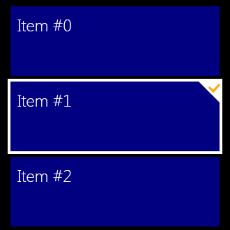
Note that the colors used for the outline and check mark are by default based on theme colors. However, they can be redefined on an individual basis like this:
<ListBox Style="{DynamicResource Metro-Control-ListBox}">
    <ListBox.Resources>
        <SolidColorBrush x:Key="CODE.Framework-Metro-TileSelectionColor" Color="Black" />
        <SolidColorBrush x:Key="CODE.Framework-Metro-TileSelectionCheckMarkColor" Color="White" />
    <ListBox.Resources>
</ListBox>
In addition, there is the Metro-Control-ListBox-Tiles style, which lays a ListBox out like Windows 8 Metro Live Tiles. The start screen view in typical Metro applications uses this style under the hood:
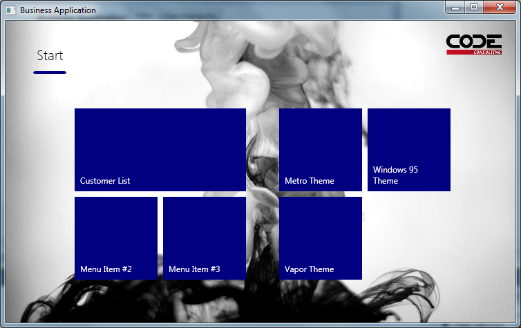
You can apply this style to any ListBox.