WPF Status Bars
The WPF MVVM/MVC modules of CODE framework support a standardized status update feature (this is typically used to implement status bars, but the exact visuals can vary from theme to theme and are fully stylable and customizable).
The basic idea is relatively simple: The Controller class has a Status() method that can be called to update the status like so:
Controller.Status("Ready.");
This sets the status message to “Ready.” and communicates this setting to the current Shell (main window). Depending on the chosen theme, this may then look different. For instance, a Metro application with this status could look like this:
Note: By default, status notifications in Metro applications are only shown for 10-12 seconds before they fade to transparency. This behavior can of course be restyled.
A Battleship (Windows 95) themed application with the same status could look like this:
In addition to setting status messages, one can also pass an overall status indicator to indicate whether the status is just informative or a warning or an error indicator, and so forth. Here is an example:
Controller.Status("Pretending to load data...", ApplicationStatus.Processing);
Depending on the theme, this information may result in a different visual style. For instance, the Metro skin by default shows status messages in a different color based on the overall state. The following screenshot shows Ready, Processing, Warning, and Error statuses respectively:
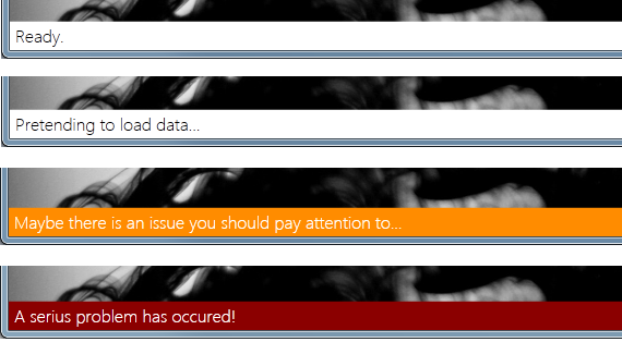
Note: Ready and Processing states by default use the same colors.
Like everything else in CODE Framework, these visuals are completely stylable both by simply re-defining the colors and brushes used as well as by creating brand new styles for the status area of the Shell. The default definition for the colors and brushes looks like this (and can be re-defined for your own purposes):
<!-- Application status bar -->
<Color x:Key="CODE.Framework-Metro-StatusReadyBackgroundColor">White</Color>
<Color x:Key="CODE.Framework-Metro-StatusReadyForegroundColor">Black</Color>
<Color x:Key="CODE.Framework-Metro-StatusProcessingBackgroundColor">White</Color>
<Color x:Key="CODE.Framework-Metro-StatusProcessingForegroundColor">Black</Color>
<Color x:Key="CODE.Framework-Metro-StatusWarningBackgroundColor">DarkOrange</Color>
<Color x:Key="CODE.Framework-Metro-StatusWarningForegroundColor">White</Color>
<Color x:Key="CODE.Framework-Metro-StatusErrorBackgroundColor">DarkRed</Color>
<Color x:Key="CODE.Framework-Metro-StatusErrorForegroundColor">White</Color>
As usual, there are brush equivalents for all those.
Customized Status Bars
Following a standard CODE Framework pattern, status updates under the hood use standardized views and view models. So when sending status updates as in the examples above, the Controller creates a standard StatusViewModel, sets Message and Status properties, uses a standardized view, and loads it into a registered view handler that can handle status updates (typically a standard Shell). All of this can be customized.
Consider the following example:
Controller.Status(model: new ExampleStatusViewModel { Message = "Some example custom message" },
                  viewName: "ExampleStatus",
                  controllerType: typeof (CustomerController));
This sets the status using a custom view model and a custom view. Here is the custom view model used here:
public class ExampleStatusViewModel : StatusViewModel
{
    public ExampleStatusViewModel()
    {
        Panel2 = "User: CODE Framework User";
        Panel3 = "Time: " + DateTime.Now.ToShortTimeString();
    }

    private string _panel2;
    public string Panel2
    {
        get { return _panel2; }
        set
        {
            _panel2 = value;
            NotifyChanged("Panel2");
        }
    }

    private string _panel3;
    public string Panel3
    {
        get { return _panel3; }
        set
        {
            _panel3 = value;
            NotifyChanged("Panel3");
        }
    }
}
Here is the example view used by this model:
<Controls:GridEx ColumnWidths="*,25,Auto,25,Auto"
  xmlns="http://schemas.microsoft.com/winfx/2006/xaml/presentation"
  xmlns:Controls="clr-namespace:CODE.Framework.Wpf.Controls;assembly=CODE.Framework.Wpf">

  <TextBlock Text="{Binding Message}" />
  <TextBlock Text="{Binding Panel2}" Grid.Column="2" />
  <TextBlock Text="{Binding Panel3}" Grid.Column="4" />

</Controls:GridEx>
Note that this view has to be defined in one of the standard view locations. If that location is not the shared location (typically it isn’t), then the system needs to know which controller the view goes with in order to find the view, which is why the controller type has to be passed as a parameter in the example above. This information provides overall execution context, so view engines can find their way around.
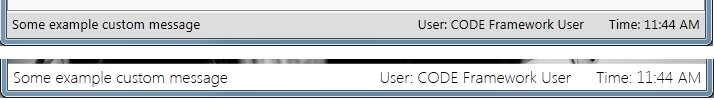
The following screenshot shows the result of this example in both Battleship and Metro modes:
When using custom view models, the Message and Status parameters if the Controller.Status() method are ignored, but one can simply set the Message and Status properties on the view model instead. Created styles still react to these properties the same way. In other words: If the Status was set to Error, without any further modifications of the view, it would look like this (assuming the default Metro style):

Note that status views and view models are unrestricted as far as features go and behave and work just like any other view. They can have any amount of data and any layout. They can have interactive controls and actions. Limitations are only set by screen real-estate. One would not want to create status bars that take up large amounts of the screen.
It is also possible to add custom actions to controllers that return status results. In most cases however, that is not needed.