Metro Start Screen
Excerpt from an internal email at EPS/CODE:
The latest version of CODE Framework has a re-written Metro start screen. Here’s an example:
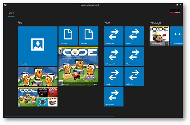
What’s new here? Well, almost everything 😃
The main element in the screen that hosts the tiles (which are populated from view-actions of course) has been re-written from scratch. The new version is now MUCH faster (the old tile screen often took quite long to load, especially with large numbers of tiles that changed a lot). That was really one of the main reasons to re-write this feature (the old tile screen was probably one of the first CODE Framework WPF features ever written 😃 ). So that in itself should be worth the upgrade.
The way this was done is through a new styeable ViewActionItemsControl that can be used to host a list of all kinds of view-actions. It is simply bound to anything that implements IHaveActions. However, it doesn’t do a straight binding, since view-actions often have to be changed from their raw approach. The order may change. There may be groupings. Some actions may not be available due to access rights. And so on. So it internally creates a new list of view-actions. And these view-actions are actually wrapped into a special new view-action wrapper class based on DependencyObject. This is technical detail that most people probably won’t care about, but it is good to know, because it means you can set attached properties on these wrappers, which can be quite useful in various scenarios. (For instance, in the tile scenarios, the size of the tiles is set that way).
So in this particular scenario, the fast-populating ViewActionItemsControl is used and it is styled to use the MetroTiles layout as it’s ItemsPanel. Furthermore, it is styled to use special templates for each action. And this is where things get interesting, because there is a template selector that allows using many different templates. (And as everything in CODE Framework, this can be changed and extended, so you can load just about anything into the tiles).
The default setup uses a logic that goes like this:
- The significance of the action is inspected, which drives the size of the tile:
- Normal and BelowNormal significance creates a small square size (“normal”)
- AboveAverage significance creates a wide tile
- Highest significance creates a large square tile
- Lowest significance creates a tiny square tile
- The exact content of the action is inspected to pick an appropriate template for the tile
- If the view-action has a populated custom view, the entire tile is used up by the defined custom view (very useful for the larger tiles)
- Generally, if the view-action uses ImageBrush objects (i.e. “references bitmap images/photos”) and all five Image properties (Image1, Image2,…Image5) are populated, it picks a special template (usually animated)
- If Image1 is populated with an ImageBrush, there is a special template for that (usually the entire tile background is filled with that image).
- If none of these are true, then a standard template is picked that shows an icon
Note: All tile templates (except custom views) also show the caption as well as other information such as an item count (“Number1”).
All these templates (and there are quite a few) are defined in Metro-Control-ViewActionItemsControl.xaml. You can override these templates at will. There is also a resource for the template selector in that file, so you can configure that object as well if you would like to use completely different templates. It is also possible to create your own template selector if you want to do something entirely different. To do so, simply create a new template selector and style it into the items control just as the default one is. This provides a degree of freedom that is quite extensive.
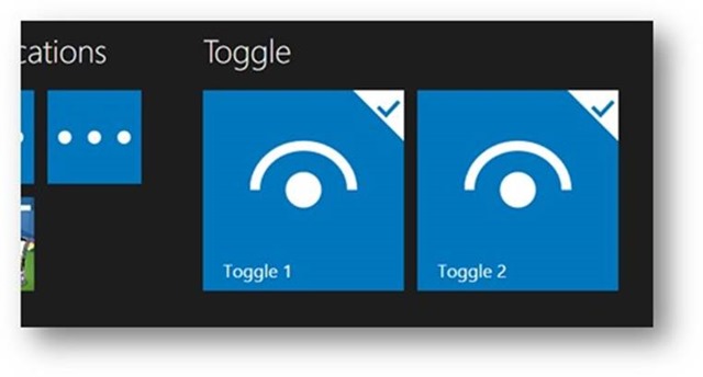
Tiles can also be “checked”. If IsChecked=true, a check-mark is shown in the tile like this:
Also, all the animations and visual effects have been overhauled. Animated tiles (in the start screen and elsewhere) now use nicer animations with subtle accelerations and decelerations. It probably doesn’t stand out as very noticeable, but it just looks a little nicer and more professional. The selection highlight is also better than it was. And there now is a nice, animated effect when the user presses a tile.
Of course all the colors can be changed easily through the standard color resources for the theme. On a side note: The default colors have changed to look a little more appealing as well. Most projects change that anyway, but it is nice to have something that looks good (rather than the crazy colors we had before) right out of the box.
This has been discussed before, but just for the record: We now support 4 different tile sizes, just like the Windows 8.1 start screen.