Understanding Layout
Note: This document is a work in progress
CODE Framework’s (optional) layout features drastically improve developer productivity and increase maintainability and reuse in your application. These features build on top of WPF’s standard layout approach and enhance it considerably. Web developers familiar with CSS and tools such as Twitter’s Boostrap will recognize the paradigm as well.
WPF introduced an approach to positioning elements on the screen that was previously unknown in the world of Windows development: Automatic layout. Using this approach, the developer doesn’t have to manually position and size elements on the screen (although that approach is still supported as well) but can instead put elements in side a container, which handles the task of arranging the controls inside of itself.
Out of the box, WPF ships with a number of such layout containers. Commonly used examples include Grid, StackPanel, and WrapPanel. For instance, when using a StackPanel, the elements inside of the StackPanel are arranged in a top-to-bottom (or left-to-right) fashion, without the developer having to ever set a single pair of X/Y coordinates.
Developers often point out that this approach is “nice”, but it has limited use in the real world. After all, how often can you create entire UIs that are just a top-to-bottom or left-to-right stack of controls? There are such scenarios (such as toolbars), but by and large, the uses are limited. This is where CODE Framework’s enhanced layout features come into play. CODE Framework offers custom layout containers that can be used at your leisure. The amazing part: These containers arrange elements in much more exciting and useful ways. There are quite a few different layout elements to choose from.
But before we talk about the details of the different layout containers, let’s lay some ground-work first to make sure we all understand what we are talking about.
Some Important WPF Layout Concepts
Using a standard WPF layout container is simple. Here is an example that shows the aforementioned StackPanel, an example you are probably familiar with:
<StackPanel>
    <Label>Hello World!</Label>
    <TextBox />
    <Button>Click me!</Button>
</StackPanel>
The result works, but it is not very visually pleasing. Using a CODE Framework layout element to spruce this up a little is just about as simple:
<l:BidirectionalStackPanel ChildItemMargin="5">
    <Label>Hello World!</Label>
    <TextBox />
    <Button>Click me!</Button>
</l:BidirectionalStackPanel>
Note: CODE Framework layout containers are defined in the CODE.Framework.Wpf.dll assembly in a namespace called CODE.Framework.Wpf.Layout. I am using this .NET namespace in XAML using the “l” namespace (but you can name it anything you want). If you use tools such as Resharper, they will help you to add the namespace in XAML if it isn’t there already. Otherwise, you have to add this attribute to your root element:
xmlns:l="clr-namespace:CODE.Framework.Wpf.Layout;assembly=CODE.Framework.Wpf"
The result probably won’t be the most exciting UI you have ever seen, but it is better than the prior version, because the BidirectionalStackPanel class has quite a few extra features. We will discuss them in more detail below, but for now, we can take note of the fact the spacing is more pleasing to the eye. (Don’t worry… we will get to more exciting layouts soon enough). The following figure shows the two examples in comparison:
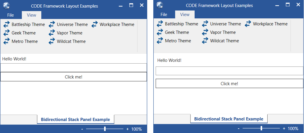
Figure 1: The window on the left uses a standard WPF StackPanel, while the one on the right uses a CODE Framework BidirectionalStackPanel. A subtle but consequential difference.
What is the main benefit of using CODE Framework layout containers? Well, the main benefit is that they provide layout features that you simply would not have otherwise in WPF. The secondary benefit is that these layout containers are theme-aware. This means that they have default styles in different themes to make them look just right in those scenarios.
Fundamentally, you now know what it takes! CODE Framework provides a number of custom layout containers for your use. They are not mandatory, but if you have a scenario where these containers are useful, we encourage you to use them. (Note: You can even use these containers in WPF projects that do not otherwise use CODE Framework. Simply add a reference to the CODE.Framework.Wpf.dll file, and you are good to go!
Layout Styles and Templates
We can also take this concept a step further. In WPF, we can either use layout elements directly as we have done so far, or we can use them by means of a template. Consider the following code snippet:
<ItemsControl>
    <ItemsControl.ItemsPanel>
        <ItemsPanelTemplate>
            <StackPanel />
        </ItemsPanelTemplate>
    </ItemsControl.ItemsPanel>

    <Label>Hello World!</Label>
    <TextBox />
    <Button>Click me!</Button>
</ItemsControl>
An ItemsControl is a generic container control for UI elements. It doesn’t itself know anything about layout, but it can refer to a layout element by means of an “items panel template”. In this case, I set this template to a StackPanel. The result is exactly the same as the original StackPanel example.
But why would I ever want to do that? It seems it just made the example more convoluted and the result was the same. However, there is a considerable difference. This approach is much more flexible and maintainable, because we decoupled the container and its children from the chosen layout. While the prior example hard-coded the layout, this version defers layout to a template. We can take this one step further yet, and move the template definition into a style:
<Style TargetType="ItemsControl" xml:Key="MyLayout">
    <Setter Property="ItemsPanel">
        <Setter.Value>
            <ItemsPanelTemplate>
                <StackPanel />
            </ItemsPanelTemplate>
        </Setter.Value>
    </Setter>
</Style>
And then we can refer to this layout in the ItemsControl:
<ItemsControl Style="{DynamicResource MyLayout}">
    <Label>Hello World!</Label>
    <TextBox />
    <Button>Click me!</Button>
</ItemsControl>
That’s much nicer! The definition of the ItemsControl is now only marginally more complex than the hard-coded StackPanel. The style can be defined in a global place (such as the application theme) and we can then use it all over the place in our application. And if we decide later that we wanted to use the BidirectionalStackPanel instead, we can simply change it in one place. In fact, different themes can have different version of the style, perhaps specifying a horizontal orientation rather than a vertical one, or perhaps changing colors, fonts, or spacing, without our actual UI definition ever having to change.
In this example, we defined our own layout style for the items control. However, CODE Framework ships with quite a number of out-of-the-box layout styles. Instead of our own style with its own name, we could have simply referred to an existing CODE Framework style:
<ItemsControl Style="{DynamicResource CODE.Framework-Layout-SimpleFormLayout}">
    <Label>Hello World!</Label>
    <TextBox />
    <Button>Click me!</Button>
</ItemsControl>
Done! This style is guaranteed to exist in every CODE Framework theme. You do not need to define any special XAML namespaces. You do not need to define a custom style. All you need to know is the name of the style resource.
So how would you know what name resources exist? Well, you could look into the CODE Framework XAML resources. Or you can read this article (see below for a complete list). But we also have an easier way: Instead of using the default WPF ItemsControl, you can use CODE Framework’s View element. This element is a sub-class of the default ItemsControl with a bunch of convenience features added. Such as StandardLayout property that makes it easy to pick one of the default layout styles:
<mvvm:View StandardLayout="SimpleForm">
    <Label>Hello World!</Label>
    <TextBox />
    <Button>Click me!</Button>
</mvvm:View>
The StandardLayout property is really just a convenience property. When set, the property simply triggers setting of the Style of the element to the resource references in the previous example.
Note: Many of the CODE Framework layout elements have a standard style equivalent. For instance, the SimpleForm standard layout (which always translates to the CODE.Framework-Layout-SimpleFormLayout resource) refers to the
BidirectionalStackPanelelement. Note however that this is not always an exact match (which is also why the names are slightly different). Most themes will decide that simple forms are to be implemented as bidirectional stack panels, but some themes may choose a different layout element. Also, themes will choose to set various properties on layout elements to non-standard settings, rather than always just going with the defaults, so that is another difference from just using the layout element directly.
The use of the View object is entirely optional, but it sure is convenient. Most people like using this object and we thus make this the default root element of UI definitions. Therefore, if all you wanted in your UI was these three elements, you could go with the following:
<mvvm:View xmlns="http://schemas.microsoft.com/winfx/2006/xaml/presentation"
           xmlns:mvvm="clr-namespace:CODE.Framework.Wpf.Mvvm;assembly=CODE.Framework.Wpf.Mvvm"
           Title="Bidirectional Stack Panel Example"
           StandardLayout="SimpleForm">

    <Label>Hello World!</Label>
    <TextBox />
    <Button>Click me!</Button>

</mvvm:View>
Note that there are other properties of interest on the View element, such as Title.
Global Styles, Themes, and Local Resources
We have now learned that we could create our own styles, or we can use existing CODE Framework ones. (Most CODE Framework apps have a combination of these). It’s worth talking a bit more about where to put these styles. There are several potential options. The first is App.xaml. Everything that is defined in there is globally available to the app. However, this is a horrible place to put it, because this file would grow completely out of control in even the smallest of WPF apps.
A better place is to put it into the theme folder of your app. Let’s say you wanted to create a new global style and you are using the Workplace theme. In that case, simply put a new XAML resource dictionary into the Themes\Workplace folder. Then, reference your new file from Workplace.xaml. What’s nice about this approach (besides it being much more orderly than the mess App.xaml creates) is that this style is now theme-specific. If you were to support more than one theme (or perhaps create a new theme for version 2.0 of your app), you can simply put a similar file into that theme’s folder and define your style slightly different. CODE Framework will handle the rest. What if you do not want your style to look any different in the new theme? Well, just copy the existing file over into that folder. (Note: You could also reference the existing file across folders, but I find that this is more trouble than it’s worth in real-world scenarios).
Using this approach, you now have a layout style that is available in your entire app. But what if you only wanted the style in a single UI? No problem. Each XAML file in the Views folder has its own associated resource files. Some are theme-specific, otherwise are always there. You can simply stick your style definition into one of these files (depending on whether you want them to change with the chosen theme or not).
One of the features most people overlook is the ability to override styles. Let’s say you stuck your style into the themes folder and were happily using it in hundreds of places, and then one form just needs a slight variation on that style. You could create a new style of course, but maybe you would like to stick with the same name for whatever reason (perhaps to keep the setup consistent in naming, or perhaps you only want that minor change in one theme, while all other themes should use the default for that particular UI). No problem either. Simply put a style of the same name into your local resource file for that UI and it will override the global one.
This also works with the default CODE Framework styles. Let’s say you started creating your application using all the out-of-the-box styles. You are now using such as style in hundreds of places, and then your boss decided that it’s desirable to have slightly different spacing or a different font size. In that case, simply grab the existing style from the CODE Framework source (the resource dictionaries are actually available in a broken out separate download for ease of access) copy it into your local theme folder, and modify it to your heart’s content. Keep the name the same. This way, it overrules the default style application-wide.
This is a very powerful feature and a very deliberate and well thought out design choice in CODE Framework. In many case, we start a new app and come out guns blazing, churning out one UI after another, because using the default themes makes it so easy. Of course, this means that things may not look exactly right as far as the project stakeholders are concerned. But you can then tweak the styles either globally or just in specific forms until everyone is happy. And best of all: It’s just a stylistic change. There is no danger of any functionality breaking, which greatly reduces the test effort.
Container Resources
Another feature that most WPF developers overlook is the ability to define styles that are only available within other styles. This is similar to the ability in CSS to create selectors, although the approach is slightly different. Take a look at this example:
<Style TargetType="ItemsControl" x:Key="CODE.Framework-Layout-SimpleFormLayout"
       BasedOn="{StaticResource CODE.Framework-Layout-SimpleFormLayout}">
    <Style.Resources>
        <Style TargetType="Button" BasedOn="{StaticResource {x:Type Button}}">
            <Setter Property="HorizontalAlignment" Value="Right" />
        </Style>
    </Style.Resources>
</Style>
This creates a new style of the same name as one of the default styles CODE Framework provides. However, it doesn’t completely start from scratch, but it instead derives everything the existing style of the same name already has. (And yes, it is absolutely legal syntax in XAML to create a new style based on a style of the same name). The style doesn’t actually change any of the style settings (although it certainly could if you had that need). Instead, it uses the little-known feature of defining resources within a style. The resource that is being defined is another style, which is an implicit style that applies to all Button elements. However, since the style is defines within another style, it only applies to buttons within controls that use the simple-form layout style.
How cool is that? Using this simple trick, we now define that our buttons are to be right-aligned, but only if they appear within a container that uses the simple form layout style. Other than that, both the button and the layout style use all their default settings they always had, because our two new styles are based on previously existing styles (one references by name, the other referencing the implicit style defined for all buttons).
The end result of all this is that the following code results in the display shown in Figure 2:
<mvvm:View xmlns="http://schemas.microsoft.com/winfx/2006/xaml/presentation"
           xmlns:mvvm="clr-namespace:CODE.Framework.Wpf.Mvvm;assembly=CODE.Framework.Wpf.Mvvm"
           Title="Bidirectional Stack Panel Example"
           StandardLayout="SimpleForm">

    <Label>Hello World!</Label>
    <TextBox />
    <Button>Click me!</Button>

</mvvm:View>
Note: Remember that setting the
StandardLayoutproperty is really just a simplified way to reference the style we changed.
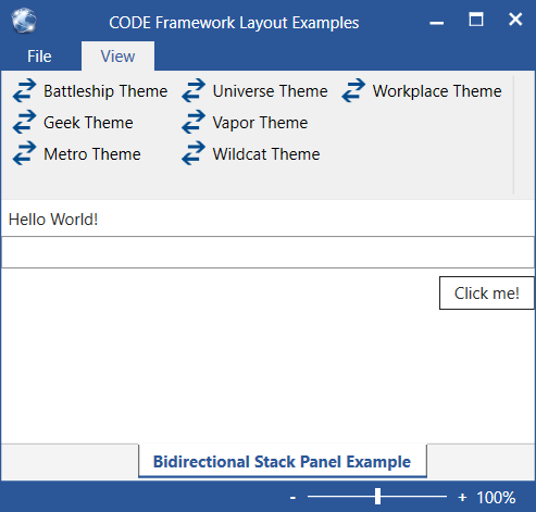
Figure 2: The default CODE Framework Simple-Form style has been overridden to cause Button elements to be right-aligned.
This technique is extremely powerful. It allows for very targeted definition of styles that only apply in specific scenarios. You can use it in nested hierarchies, and you can use it for all properties in these elements. Want more spacing before the button? Well, just set the Margin property in your style.
Composing UIs
The final concept that I am always surprised to see overlooked a lot, is the ability to compose user interfaces out of multiple containers. No matter how fancy a bidirectional stack panel CODE Framework provides, it is still just a single control with limited layout capabilities. This might be the simples of the CODE Framework layout elements, but even the most powerful ones are somewhat unlikely to define entire user interfaces on their own. Instead, UIs are composed out of hierarchies of these objects.
Consider the example shown in Figure 3 for instance. This entire interface contains no hard-coded layout, but it contains a composition of multiple layout containers. The root uses a…
Figure 3
Creating Custom Layout Elements
In addition to using the custom layout elements provided by CODE Framework, you can also create your own. You may be surprised to find that it isn’t as hard as you might think. If you ever wrote any code that handles manual screen resizing, you already know what’s involved. A detailed discussion of this subject is beyond the scope of this article, but we have another article that covers this very subject: http://www.codemag.com/Article/1011071
Hard-Coding UIs
Does all of this mean that you will never use a Grid element again in your WPF apps and manually drop elements into it and define their positions by hand? No, it doesn’t. The Grid element has a bright future in WPF in general and in CODE Framework specifically as well. Not all user interfaces can benefit from templated layout. Sometimes you will just have to sit down and do it by hand and that’s fine. Sometimes you can use templated layouts for most of a form, but one small section may have to be laid out by hand. That’s fine too.
The rule of thumb is that CODE Framework’s layout elements are supposed to make your life easier. We encourage you to learn about them and use them wherever they provide a benefit. The benefit may be short-term, when it is simply faster and easier to create templated layouts. The benefit may be functional, when you want to support different themes (as often happens either in a single version of an app, or over multiple versions of an app as the look evolves). The benefit can also be related to maintainability and consistency of the provided interface. But weigh those benefits carefully. When an interface is so highly specialized that composing it out of templated layouts becomes so difficult that the difficulty outweighs the benefits, then I would not hesitate to create the layout manually the old-fashioned way. (Just make sure you don’t just use the hard-coded approach because “that’s what we have always done”, or because "that’s what we know").
Provided Layout Features
Now that we understand the concepts and ideas behind CODE Framework’s layout features, we can start diving into an individual review of each of the elements and how to use them.
Each layout element can either be used directly (such as using a BidirectionalStackPanel). Most layout elements also have a pre-defined layout style that can be applied to any ItemsControl (such as the CODE.Framework-Layout-SimpleFormLayout style). But using the style names can be a frustrating experience of memorization (the names are deliberately long to avoid potential conflicts with other styles… “SimpleForm” would be much easier to remember, but changes are much greater than someone already has a style of that name in their app). For this reason, all such styles can be used through the StandardLayout property on the View. (The View also defines numerous other interesting features. See below for more details).
Another nifty trick to remember is that the New-View Wizard provided by the CODE Framework Tools Visual Studio Extension provides a list of all standard layouts with a visual representation and a quick description of what the style does (Figure 4). When in doubt, you can always use this wizard to create a temporary XAML file and see what it produces. It’s a good learning tool.
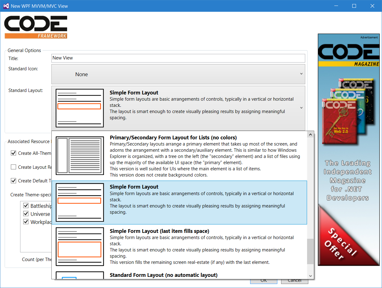
Figure 4: The New View Wizard provides a handy list of all standard layouts with a visual representation and a quick description.
Bidirectional Stack Panel and Simple Form Layouts
The BidirectionalStackPanel layout element is one of the simpler layout elements provided by CODE Framework (which is why I have used it in introductory examples above). It’s quite similar in concept to the standard StackPanel class, but it adds a number of useful features.
This layout approach can be referenced in the following ways:
- Element name: BidirectionalStackPanel
- XAML namespace declaration: clr-namespace:CODE.Framework.Wpf.Layout;assembly=CODE.Framework.Wpf
- Style key: CODE.Framework-Layout-SimpleFormLayout and CODE.Framework-Layout-SimpleFormToFillLayout
- Standard layout: SimpleForm and SimpleFormToFill
Note: As for all layout elements, the style resource (and the standard layout reference} typically uses this layout element, but there may be differences in some themes.
The basic use of this layout element is the following:
<l:BidirectionalStackPanel>
    <Label>Hello World!</Label>
    <TextBox />
    <Button>Click me!</Button>
</l:BidirectionalStackPanel>
This creates the result shown in Figure 1.
The default approach lays elements out top-to-bottom (or left-to-right if the Orientation property is set accordingly) with no margin around elements. However, it is possible to set the margin for child items to create a visual appearance that is more useful for laying out controls in a user interface. Margin for child items will be applied to all elements within the panel. However, it is often desirable to not have a margin at the bottom of text elements. For instance, when laying out a UI that has text elements (like text blocks) followed by textboxes, followed by text element, followed by textbox, then it is reasonable to assume that the text is a label that goes with the control that follows, and therefore, it often makes sense to not add any special margin between these controls. This can be achieved by setting the IgnoreChildItemBottomMarginForTextElements property to true (which is actually the default). The following example takes advantage of these features:
<l:BidirectionalStackPanel ChildItemMargin="10,8" IgnoreChildItemBottomMarginForTextElements="true">
    <Label>Hello World!</Label>
    <TextBox />
    <Button>Click me!</Button>
</l:BidirectionalStackPanel>
This results in the UI shown in Figure 5, which looks much more pleasing and professional than the version shown in Figure 1.
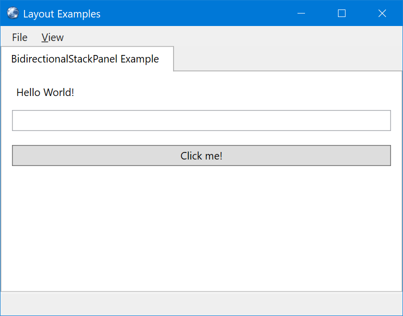
Figure 5: Setting a child item margin creates a pleasing margin around each of the contained elements, achieving a more useful UI layout when compared to standard StackPanel layouts.
The reason the control is called a bidirectional stack panel is that it can flow elements in from two direction (contrary to the default StackPanel control, which flows elements from one direction only). Therefore, all elements with a VerticalAlignment of Bottom, will be flown in from the bottom, while everything else flows from the top. (This also works in a horizontally aligned bidirectional panel, but in that case the HorizontalAlignment property is used to determine flow direction). The following example always arranges the button at the bottom:
<l:BidirectionalStackPanel ChildItemMargin="10,8" IgnoreChildItemBottomMarginForTextElements="true">
    <Label>Hello World!</Label>
    <TextBox />
    <Button VerticalAlignment="Bottom">Click me!</Button>
</l:BidirectionalStackPanel>
Figure 6 shows the result.
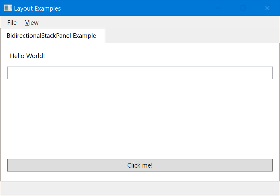
Figure 6: The button is positioned at the bottom of the available space, due to its vertical alignment being set to “Bottom”.
In some scenarios, it is desirable to have the last top element fill the available space. For instance, in our current example, the textbox could always fill the space “in the middle”, no matter how much space there is. This can be done by setting the LastTopItemFillsSpace property to true:
<l:BidirectionalStackPanel ChildItemMargin="10,8" IgnoreChildItemBottomMarginForTextElements="true" LastTopItemFillsSpace="true">
    <Label>Hello World!</Label>
    <TextBox />
    <Button VerticalAlignment="Bottom">Click me!</Button>
</l:BidirectionalStackPanel>
There also is a special margin property (LastTopItemFillMargin) if you want to fine-tune the margin just for that last control. Figure 7 shows this UI.
Figure 7: With the BidirectionalStackPanel set to fill the space with the last top item, the textbox takes up all the available space (while the button is at the bottom due to its vertical alignment setting).
Sometimes, not all the elements fit into the available space on screen. The default StackPanel class simply causes elements to flow out the bottom (or right) of the panel. The BidirectionalStackPanel on the other hand will show a scroll bar in those cases. (This behavior can be turned off using the ScrollBarMode property). We can easily force this behavior by setting a minimum height for the last top item:
<l:BidirectionalStackPanel ChildItemMargin="10,8" IgnoreChildItemBottomMarginForTextElements="true" LastTopItemFillsSpace="true">
    <Label>Hello World!</Label>
    <TextBox MinHeight="300"/>
    <Button VerticalAlignment="Bottom">Click me!</Button>
</l:BidirectionalStackPanel>
Now, whenever the total height of the panel isn’t tall enough to fit all the controls, a scrollbar appears, as shown in Figure 8.
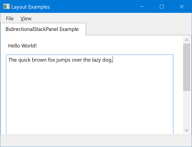
Figure 8: Whenever there isn’t enough space to fit all elements into the available space, a scroll bar is displayed (unless that feature is specifically disabled).
As always, it is often desirable to not use the control directly, but to use a View container instead. The version that fills the space (identical to Figure 8, although different themes will apply different spaces) can be coded like this:
<mvvm:View StandardLayout="SimpleFormToFill">
    <Label>Hello World!</Label>
    <TextBox MinHeight="300"/>
    <Button VerticalAlignment="Bottom">Click me!</Button>
</mvvm:View>
Note that the chosen standard layout is the “…ToFill” variation, which simply invokes a style that sets the LastTopItemFillsSpace property to true. The standard version on the other hand, produces the same result as Figure 6:
<mvvm:View StandardLayout="SimpleForm">
    <Label>Hello World!</Label>
    <TextBox/>
    <Button VerticalAlignment="Bottom">Click me!</Button>
</mvvm:View >
Standard Form Layout
“Standard Forms” aren’t even really a special layout approach, but they shall be mentioned here for completeness. Standard forms simply are an abstraction of a Grid element (with all the child elements laid out manually as in any WPF Grid) so the styled approach can be used even for manual layouts.
- Element name: n/a
- XAML namespace declaration: n/a
- Style key: CODE.Framework-Layout-StandardFormLayout
- Standard layout: StandardForm
An example of the use of this style looks like this:
<mvvm:View StandardLayout="StandardForm">
    <Label Margin="20,40,0,0" VerticalAlignment="Top">Hello World!</Label>
    <TextBox Margin="20,80,20,0" VerticalAlignment="Top"/>
    <Button Margin="20,0,20,20" VerticalAlignment="Bottom" HorizontalAlignment="Left">Click me!</Button>
</mvvm:View>
This is really the same as this:
<Grid>
    <Label Margin="20,40,0,0" VerticalAlignment="Top">Hello World!</Label>
    <TextBox Margin="20,80,20,0" VerticalAlignment="Top"/>
    <Button Margin="20,0,20,20" VerticalAlignment="Bottom" HorizontalAlignment="Left">Click me!</Button>
</Grid>
Note that the advantage of the prior approach is that it is based on a style that can be tweaked and generically maintained and changed, while the second version is always hardcoded to use a Grid.
Multi Panel Layouts
- Element name: MultiPanel
- XAML namespace declaration: clr-namespace:CODE.Framework.Wpf.Layout;assembly=CODE.Framework.Wpf
- Style key: CODE.Framework-Layout-MultiPanelLayout, CODE.Framework-Layout-MultiPanelWithHeaderLayout, CODE.Framework-Layout-MultiPanelVerticalLayout, CODE.Framework-Layout-MultiPanelVerticalWithHeaderLayout
- Standard layout: MultiPanel, MultiPanelWithHeaders, MultiPanelVertical, MultiPanelVerticalWithHeaders
Multi panel layouts arrange child elements as proportional panels inside of the main layout element. This is useful in scenarios where you want the available space within an element (often the entire View) to be split (horizontal or vertical) between however many child elements are visible. Optionally, each individual sub-element can be shown with a customizable (and stylable) header. This is definitely easier to show than explain, so take a look at Figure 9 for an example.
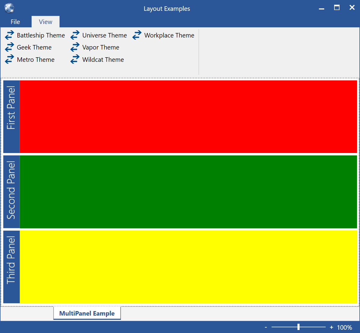
Figure 9: A multi-panel form with 3 panels (the colored rectangles serve as simple placeholders for more advanced contained UIs) and panel headers.
Note: Multi panel UIs can often be used interchangeably with tabbed UIs (see below). A multi panel UI can be thought of as a tab control with multiple “tabs” visible at the same time. Another possible alternative are "blades" (see below), which are somewhat similar to the multi panel approach, except the size-strategy for the contained elements uses the exact opposite approach (rather than splitting the space and assigning sizes to the individual elements, the size of blades is driven by the child elements).
The simplest version of a MultiPanel layout, simply takes all contained (and visible) child elements, and splits the available space between them. Consider this example:
<l:MultiPanel>
    <Rectangle Fill="Red"/>
    <Rectangle Fill="Green"/>
    <Rectangle Fill="Yellow"/>
</l:MultiPanel>
This results in the UI shown in Figure 10.
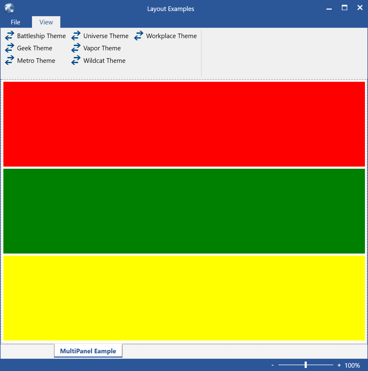
Figure 10: A very simple MultiPanel, with the contained UI elements splitting the available space horizontally.
By default, all elements are sized the same. However, the relative size of elements can be changed in a fashion very similar to changing Grid dimensions. Of course, the Rectangle object used in this example has no concept of having a certain size in a MultiPanel layout. Therefore, the size is set by means of an attached property provided by the View object:
<Rectangle Fill="Red" mvvm:View.RelativeHeight="2*"/>
By default, all elements have a relative height of 1*, but by setting the relative height to 2* on the red rectangle, it is assigned twice as much space as the other rectangles (see Figure 11).
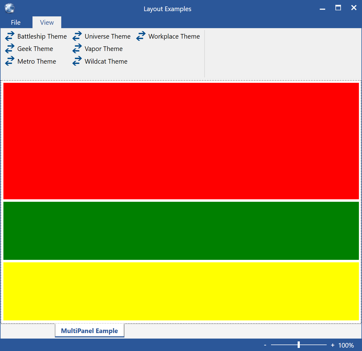
Figure 11: The relative height of the red rectangle is twice that of the other two rectangles.
Note that it is possible to orient the panel “the other way”. By default, the arrangement is top-to-bottom (vertical), but by setting the Orientation property to Horizontal, the elements are arranges as shown in Figure 12. Relative widths of horizontally arranged elements in a MultiPanel are set through the RelativeWidth attached property on the View element.
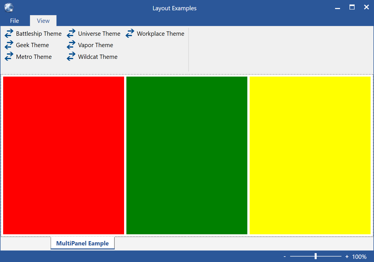
Figure 12: A horizontal MultiPanel arrangement.
Another setting that is often useful is the ability to change the spacing between elements by setting the Spacing property.
It is often desirable (although completely optional) to show headers for each panel. Headers are completely customizable (either by setting properties on header renderer objects, or by implementing custom renderers) and can be turned on by configuring a header renderer object on the MultiPanel:
<l:MultiPanel>
  <l:MultiPanel.HeaderRenderer>
    <l:MultiPanelHeaderRenderer Background="Black" Foreground="White" FontSize="16" Orientation="Vertical"/>
  </l:MultiPanel.HeaderRenderer>

  <Rectangle Fill="Red" mvvm:View.Title="First Panel" mvvm:View.RelativeHeight="2*"/>
  <Rectangle Fill="Green" mvvm:View.Title="Second Panel"/>
  <Rectangle Fill="Yellow" mvvm:View.Title="Third Panel"/>
</l:MultiPanel>
In this example, the HeaderRenderer property of the MultiPanel object is set to a default MultiPanelHeaderRenderer element provided by CODE Framework. (It is possible to implement your own). This header renderer allows setting a number of properties, such as fonts and colors of the rendered header.
Note that most header renderers need a title to display in the header. Again, Rectangle elements do not have titles, but once again, the attached Title property on the View object comes to the rescue. The result is shown in Figure 13. Note that the default header renderer allows showing headers either vertical or horizontal. For an example of horizontal headers, see Figure 14.
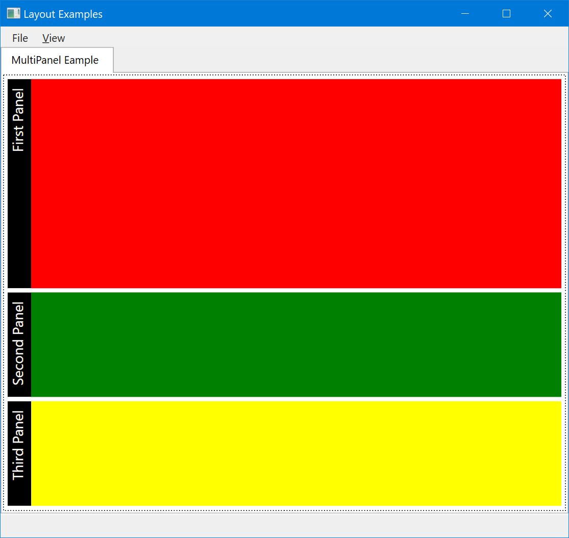
Figure 13: A MultiPanel with vertical headers.
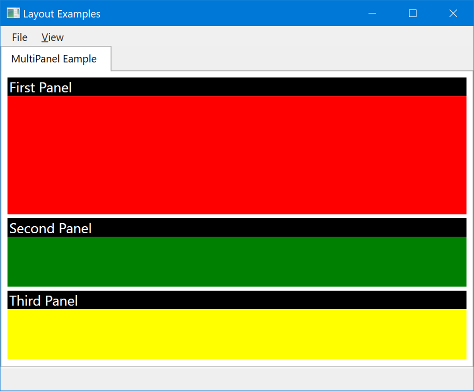
Figure 14: The same UI as in Figure 13, but with horizontal headers configured.
Elements within the multi-panel layout are only displayed when they are visible. Collapsed icons are not displayed at all and completely ignored for layout. (Elements with collapsed visibility are considered “closed”). It is often useful to bind the Visibility property of contained elements to a view-model property to be able to toggle their visibility on and off. Another option is to display a clickable icon in the header that "closes" the element (by collapsing it). To enable this, two things have to be done: 1) the header renderer has to define an icon, and 2) each contained element has to indicate whether it can be collapsed. Defining an icon can be done by referring to one of the standard CODE Framework icons, or by defining your own icon resource:
<l:MultiPanelHeaderRenderer CloseIcon="{DynamicResource CODE.Framework-Icon-ClosePane}"/>
Then, each element can individually decide whether it wants to be closable. To make the red rectangle closable, we can do this:
<Rectangle Fill="Red" mvvm:View.Title="First Panel" mvvm:View.Closable="True"/>
Now, when the user clicks on the close icon in the header, the red rectangle disappears as its visibility is set to collapsed state. Note that sometimes it is desirable to have more control over what happens when the icon is clicked. For this purpose, a ViewAction can be assigned to the icon, like so:
<Rectangle Fill="Red" mvvm:View.Title="First Panel" mvvm:View.Closable="True"
           mvvm:View.CloseAction="{Binding CloseAction}" Visibility="{Binding Panel1Visible}"/>
This triggers the specified action, which can do anything desired. Usually, this includes setting the panel invisible by setting a bound property accordingly (Panel1Visible, in this example). It is important to know that whenever a custom action is assigned to the close icon, no actual hiding of the element is performed, unless the action’s execute code somehow triggers a visibility change.
MultiPanels have a few more tricks up their sleeve. One is the ability to set a panel to “flow with the previous” element. This means that it doesn’t get pushed into a new row or column, but it instead flows in along the previous. Figure 15 shows an example of such a UI. Here is the code that produces it:
<l:MultiPanel>
  <Rectangle mvvm:View.Title="One" mvvm:View.Closable="True" mvvm:View.RelativeHeight="2*" Fill="Red" Stroke="Green" StrokeThickness="2"/>
  <Rectangle mvvm:View.Title="One B" mvvm:View.Closable="True" Fill="Maroon" Stroke="Green" StrokeThickness="2" mvvm:View.FlowsWithPrevious="True" Width="150"/>
  <Rectangle mvvm:View.Title="Two" mvvm:View.TitleColor="Maroon" mvvm:View.SupportsDocking="True" Fill="Blue" Stroke="Green" StrokeThickness="2"/>
  <Rectangle mvvm:View.Title="And Three" mvvm:View.Closable="True" Fill="Yellow" Stroke="Green" StrokeThickness="2"/>
</l:MultiPanel>
Note the View.FlowsWithPrevious property setting on the second rectangle. This causes that element to flow into the same row as the previous rectangle. It is given a width of 150 pixels, since that is the hardcoded width for that element. This example has a few other interesting details. The header of the blue rectangle in Figure 15 has a different title color from the others. This is due to the title color being set using the View.TitleColor attached properties. Depending on the utilized header renderer, this setting may or may not be respected (the header renderer has properties – UseTitleColorForBackground and UseTitleColorForForeground - to indicate whether it is desirable to respect the title color). Some themes (such as the Universe theme shown in Figure 15) respect title colors out of the box, while others do not (but it is of course always possible to force the issue by hardcoding the setting or – better – by changing the style as needed).
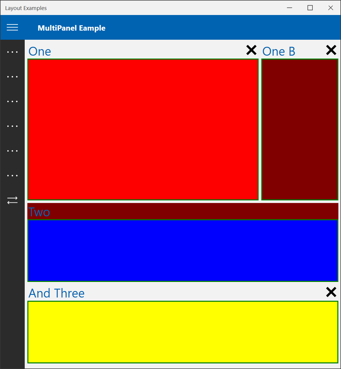
Figure 15: The maroon colored rectangle flows into the same “row” as the red one, since it is set to "flow with previous". Also, note the colored header for the blue rectangle.
Another interesting detail in this example is the ability to undock panels and float them around the desktop as separate windows. In this example, the blue rectangle can be undocked, because it has the View.SupportsDocking property set to true. With this, the user can grab the header and undock the panel. Figure 16 shows an example. (Note: The style of the window used for undocked elements can be customized).
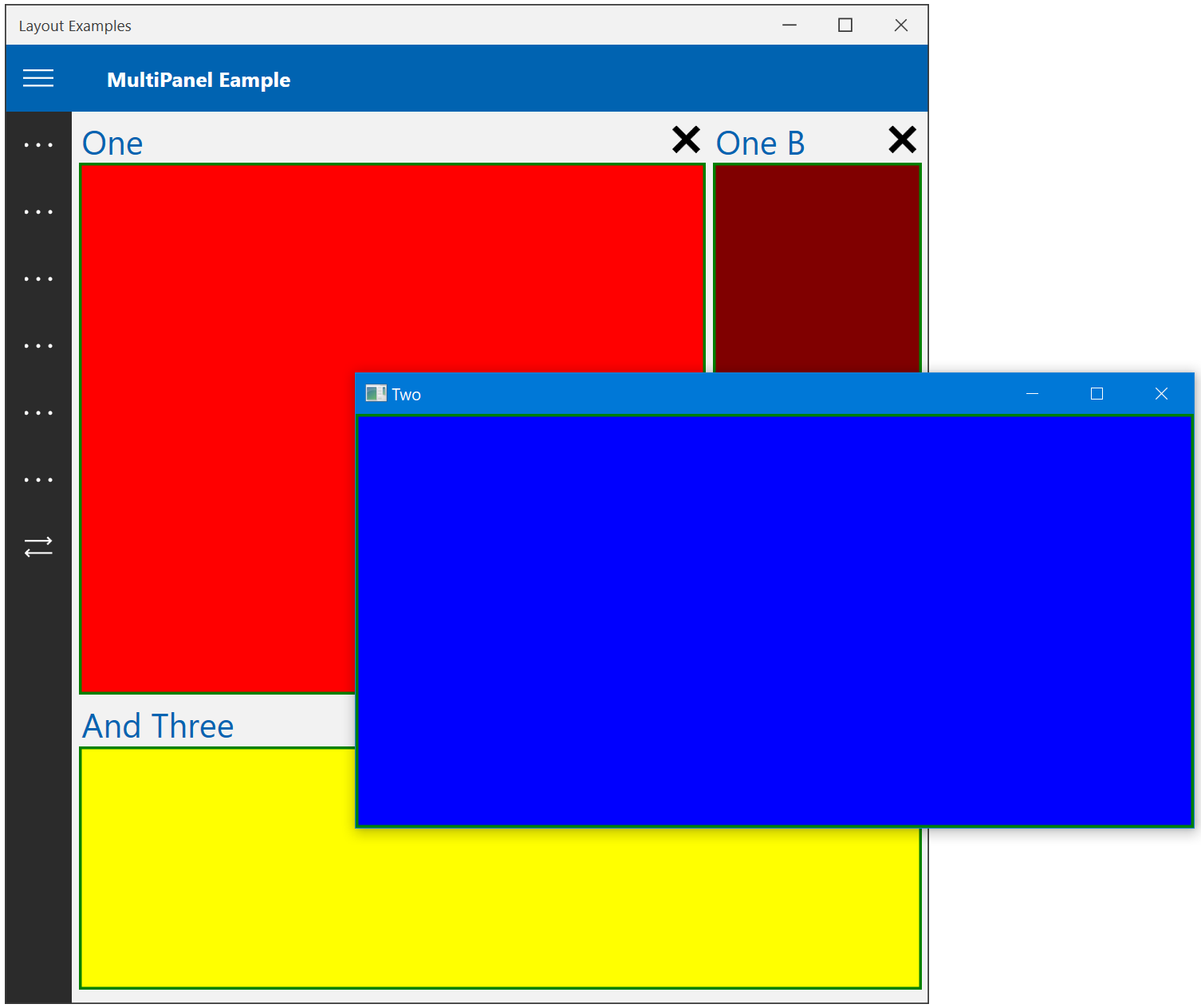
Figure 16: An undocked panel floating on the desktop as an independent window.
In most CODE Framework uses, it is not necessary to hard-code the use of a MultiPanel. Instead, it is more desirable to create a View that uses this layout approach. The following code snippet shows such an example:
<mvvm:View xmlns="http://schemas.microsoft.com/winfx/2006/xaml/presentation"
           xmlns:mvvm="clr-namespace:CODE.Framework.Wpf.Mvvm;assembly=CODE.Framework.Wpf.Mvvm"
           Title="MultiPanel Eample" StandardLayout="MultiPanelWithHeaders">
    <Rectangle Fill="Red" mvvm:View.Title="First Panel" />
    <Rectangle Fill="Green" mvvm:View.Title="Second Panel"/>
    <Rectangle Fill="Yellow" mvvm:View.Title="Third Panel"/>
</mvvm:View>
This creates the result shown in Figure 9. Note that there are two standard layouts available for multi-panels: MultiPanel and MultiPanelWithHeaders. You guessed it: One has headers, the other doesn’t. When using the one with headers, no further configuration is needed. Each theme defines an appropriate style to display headers in the right colors, fonts, and orientation. Headers support close icons when contained elements are flagged as closable.
In most scenarios, MultiPanel layouts do not lay out random elements, but they often use contained view elements, which themselves have advanced child layouts. It is also quite common that the contained child elements are a combination of individual elements and View elements:
<mvvm:View xmlns="http://schemas.microsoft.com/winfx/2006/xaml/presentation"
           xmlns:mvvm="clr-namespace:CODE.Framework.Wpf.Mvvm;assembly=CODE.Framework.Wpf.Mvvm"
           Title="Advanced MultiPanel Layout" StandardLayout="MultiPanelWithHeaders">

    <ListBox mvvm:View.Title="List Example" />

    <mvvm:View Title="Edit Form Example" StandardLayout="EditForm" RelativeHeight="2*">
        <!-- More elements go here... -->
    </mvvm:View>

</mvvm:View>
Figure 17 shows a more fleshed out version of this approach, with richly formatted child elements.
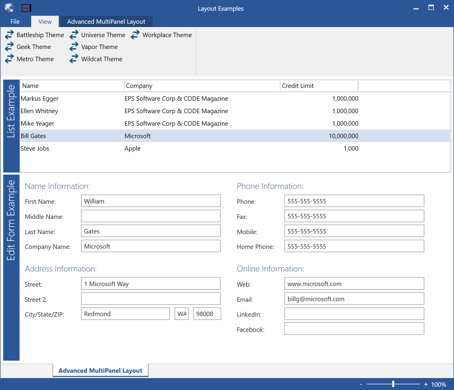
Figure 17: An advanced MultiPanel layout utilizes a ListBox and a View as child elements, achieving a sophisticated layout with ease.
Blade Panel UIs
- Element name: BladePanel
- XAML namespace declaration: clr-namespace:CODE.Framework.Wpf.Layout;assembly=CODE.Framework.Wpf
- Style key: CODE.Framework-Layout-BladePanelLayout, CODE.Framework-Layout-BladePanelWithHeaderLayout, CODE.Framework-Layout-BladePanelToFillLayout, CODE.Framework-Layout-BladePanelWithHeaderToFillLayout
- Standard layout: Blades, BladesToFill, BladesWithHeaders, BladesWithHeadersToFill
Blade UIs are conceptually quite similar to multi-panels, and in fact, people tend to confuse the two. The main difference is that multi-panels split the available space between the child elements (this assigning each a portion of the size available), while blades are sized based on the need of the contained elements, giving each the desired space, and creating a scrolling setup if needed. Blades are also always flowing left-to-right.
To use an example similar to the one used for multi-panels, here is a simple blade setup with three differently sized and colored rectangles:
<l:BladePanel>
  <Rectangle Width="300" Fill="Red"/>
  <Rectangle Width="400" Fill="Green"/>
  <Rectangle Width="200" Fill="Yellow"/>
</l:BladePanel>
This creates the result shown in Figure 18. Note that the width of each panels is driven by the defined width for each child element. Each child is given the width it asks for, regardless of whether that is due to a hardcoded width (as in this example), or whether the contained element itself is auto-sizing in some way. Also note that whenever there is not enough horizontal space available to fit all elements, a horizontal scrollbar appears.
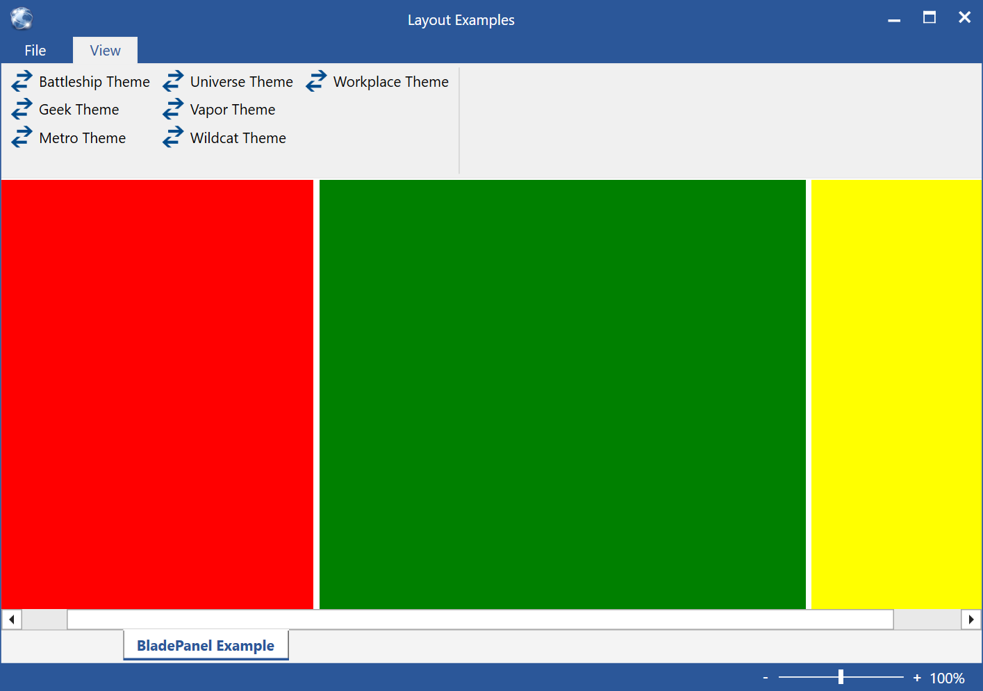
Figure 18: Three colored rectangles are shown as blades arranged left-to-right. Since there is not enough room to fit them all, a scrollbar is shown.
It is also possible to force the last element to use up all the available space. This is done by setting the LastTopItemFillsPace property to true. (Note: The naming of this property is done for consistency with other CODE Framework elements, even though it is actually the right-most item that fills the space, rather than the top one).
<l:BladePanel LastTopItemFillsSpace="True">
  <Rectangle Width="300" Fill="Red"/>
  <Rectangle Width="400" Fill="Green"/>
  <Rectangle Fill="Yellow"/>
</l:BladePanel>
In this case, the yellow rectangle fills up however much space there is left for it. (Note: If there isn’t enough space to show all three rectangles, a scrollbar appears). The last element generally is sized to fill the available remaining space. However, it is possible to set a minimum size using the element’s MinWidth property. If this results in too wide a layout, scrollbars will be shown.
It is also possible to have some blades stick to the right edge (similar to a bidirectional stack panel) by setting the horizontal alignment:
<l:BladePanel LastTopItemFillsSpace="True">
  <Rectangle Width="300" Fill="Red"/>
  <Rectangle Fill="Green"/>
  <Rectangle Width="200" HorizontalAlignment="Right" Fill="Yellow"/>
</l:BladePanel>
Not only does that keep the yellow rectangle docked to the left, but a potential scrollbar only applies to the left-aligned elements.
The BladePanel class has properties to set spacing between the elements. Also, as with the multi-panel setup, it is possible (and often desired) to show headers for each blade:
<l:BladePanel LastTopItemFillsSpace="True">
  <l:BladePanel.HeaderRenderer>
    <l:BladePanelHeaderRenderer Background="Black" Foreground="White" Orientation="Vertical" FontSize="18"/>
  </l:BladePanel.HeaderRenderer>
  <Rectangle Width="300" Fill="Red" mvvm:View.Title="First Panel"/>
  <Rectangle Width="300" Fill="Green" mvvm:View.Title="Second Panel"/>
  <Rectangle Width="400" Fill="Yellow" mvvm:View.Title="Third Panel" HorizontalAlignment="Right"/>
</l:BladePanel>
The result is shown in Figure 19. As you can see, the header renderer picks up the blade’s title in a fashion identical to the multi-panel. (Note: This makes it possible to simply switch the layout style from blades to multi-panels and have the same headers appear). It is of course also possible to show headers horizontal across the blades by setting the Orientation property on the renderer (see Figure 20). Header renderers for blades are very similar to header renderers for multi-panels, including the ability to implement your own header renderers.
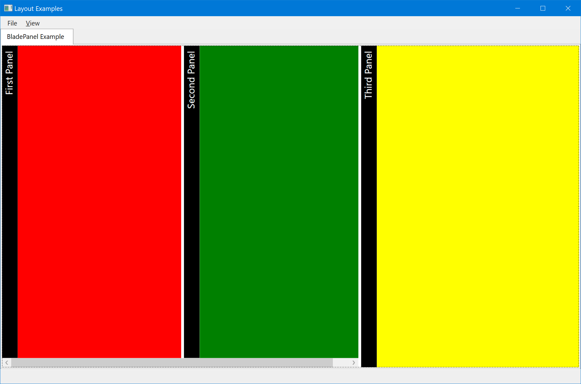
Figure 19: Blades with vertical headers. The third blade is right-aligned. Since there isn’t enough space to show both left-aligned blades, a scroll bar is shown.
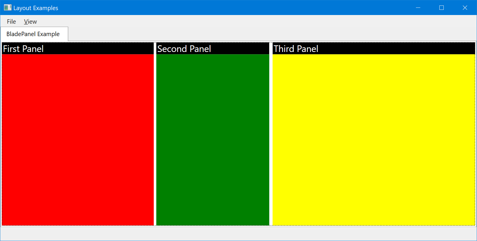
Figure 20: Blades with horizontal headers.
As is the case with most CODE Framework layouts, it is desirable to use blade layouts simply by invoking a style or standard-layout, rather than hard-coding the layout. Here is an example that produces the same result as in Figure 19/18, but simply by applying a View with a style. (Note that exact colors and orientation change with each theme):
<mvvm:View xmlns="http://schemas.microsoft.com/winfx/2006/xaml/presentation"
           xmlns:mvvm="clr-namespace:CODE.Framework.Wpf.Mvvm;assembly=CODE.Framework.Wpf.Mvvm"
           Title="BladePanel Example" StandardLayout="BladesWithHeadersToFill">

    <Rectangle Width="300" Fill="Red" mvvm:View.Title="First Panel"/>
    <Rectangle Fill="Green" mvvm:View.Title="Second Panel"/>
    <Rectangle Width="250" Fill="Yellow" mvvm:View.Title="Third Panel" HorizontalAlignment="Right"/>

</mvvm:View>
And just like in the MultiPanel example, BladePanel layouts are generally used to have more complex items as their child elements, such as lists or other views. The following is essentially the same example as shown in Figure 17, but using the BladePanel approach. (Note that switching layouts between different approaches without changing the embedded elements is one of the major advantages of this approach):
<mvvm:View xmlns="http://schemas.microsoft.com/winfx/2006/xaml/presentation"
           xmlns:mvvm="clr-namespace:CODE.Framework.Wpf.Mvvm;assembly=CODE.Framework.Wpf.Mvvm"
           Title="Advanced BladePanel Layout" StandardLayout="BladesWithHeaders">

    <ListBox Width="500" mvvm:View.Title="List Example" ItemsSource="{Binding ExampleList}" controls:ListEx.Columns="{Binding ExampleListColumns}"/>

    <mvvm:View Title="Edit Form Example" StandardLayout="EditForm">
        <!-- More elements go here... -->
    </mvvm:View>
</mvvm:View>
The result is shown in Figure 21. Make sure you compare both the code and the result to what is shown in Figure 17.
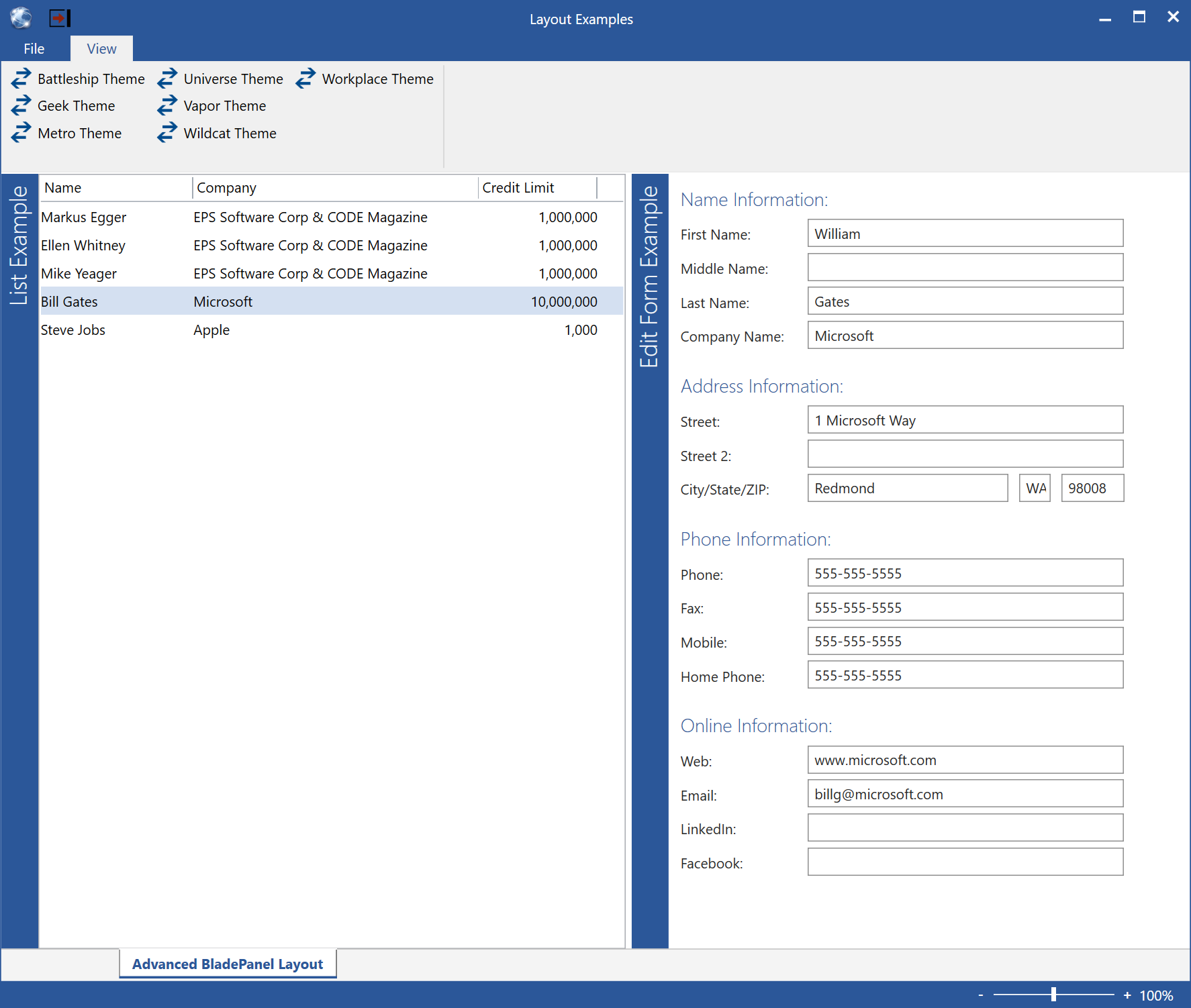
Figure 21: An advanced layout with two blades.
Tabbed UIs
- Element name: TabItemPanel
- XAML namespace declaration: clr-namespace:CODE.Framework.Wpf.Layout;assembly=CODE.Framework.Wpf
- Style key: CODE.Framework-Layout-Tabs
- Standard layout: Tabs
Tabbed UIs are exactly what the name indicates: They use a tab-control type of layout approach. Figure 22 shows such an example.
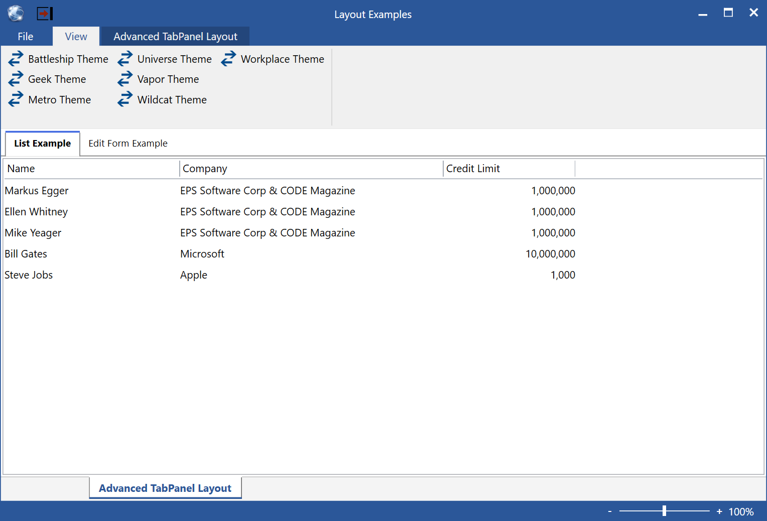
Figure 22: The tab-panel layout displays its children within separate “tabs”, similar to a TabControl.
Note that the TabPanel layout is not meant to replace the standard WPF TabControl, and it doesn’t have all of the same features. Instead, this layout element is there to provide a generic and stylable layout approach for tabs. The beauty of having this layout element is that the display in Figure 22 was simply created by switching the style of the example shown in Figure 21. This is super-useful, but it isn’t meant for all scenarios. If you require features the TabControl has that are not available in the style, use the TabControl instead, but weight the advantages and disadvantages of having the styled layout.
Here is the code that produces the UI shown in Figure 22:
<mvvm:View xmlns="http://schemas.microsoft.com/winfx/2006/xaml/presentation"
           xmlns:mvvm="clr-namespace:CODE.Framework.Wpf.Mvvm;assembly=CODE.Framework.Wpf.Mvvm"
           Title="Advanced TabPanel Layout" StandardLayout="Tabs">

    <ListBox mvvm:View.Title="List Example" ItemsSource="{Binding ExampleList}" controls:ListEx.Columns="{Binding ExampleListColumns}"/>

    <mvvm:View Title="Edit Form Example" StandardLayout="EditForm" RelativeHeight="2*">
        <!-- More elements go here... -->
    </mvvm:View>

</mvvm:View>
As always, the layout can be driven by the style as shown above, as well as by using the layout panel directly. (The panel class is called TabItemsPanel).
Primary/Secondary UIs
- Element name: GridPrimarySecondary
- XAML namespace declaration: clr-namespace:CODE.Framework.Wpf.Layout;assembly=CODE.Framework.Wpf
- Style key: CODE.Framework-Layout-PrimarySecondaryFormLayout, CODE.Framework-Layout-ListPrimarySecondaryFormLayout, CODE.Framework-Layout-PrimarySecondaryFormLayout-NoColor, CODE.Framework-Layout-ListPrimarySecondaryFormLayout-NoColor
- Standard layout: PrimarySecondaryForm, PrimarySecondaryListForm, PrimarySecondaryFormNoColor, PrimarySecondaryListFormNoColor
Primary/Secondary UIs are the granddaddy of CODE Framework templated UIs. Their basic idea is simple: Many UIs has a “primary” or "main" part of the UI, while being augmented by “secondary” parts. Consider Windows Explorer for instance. Its "primary" part is the list of files in a folder. However, there is a secondary part, which is the tree-view that shows you which folder you are in. Many business applications have similar examples. One of the most commonly used ones are search screens, which show a list of search results as the main content, but they are augmented by a UI that allows entering search criteria. The ultimate goal is to create a user interface that looks like the UIs shown in Figure 23 and Figure 24 (which are the same UI but with different themes/skins applied).
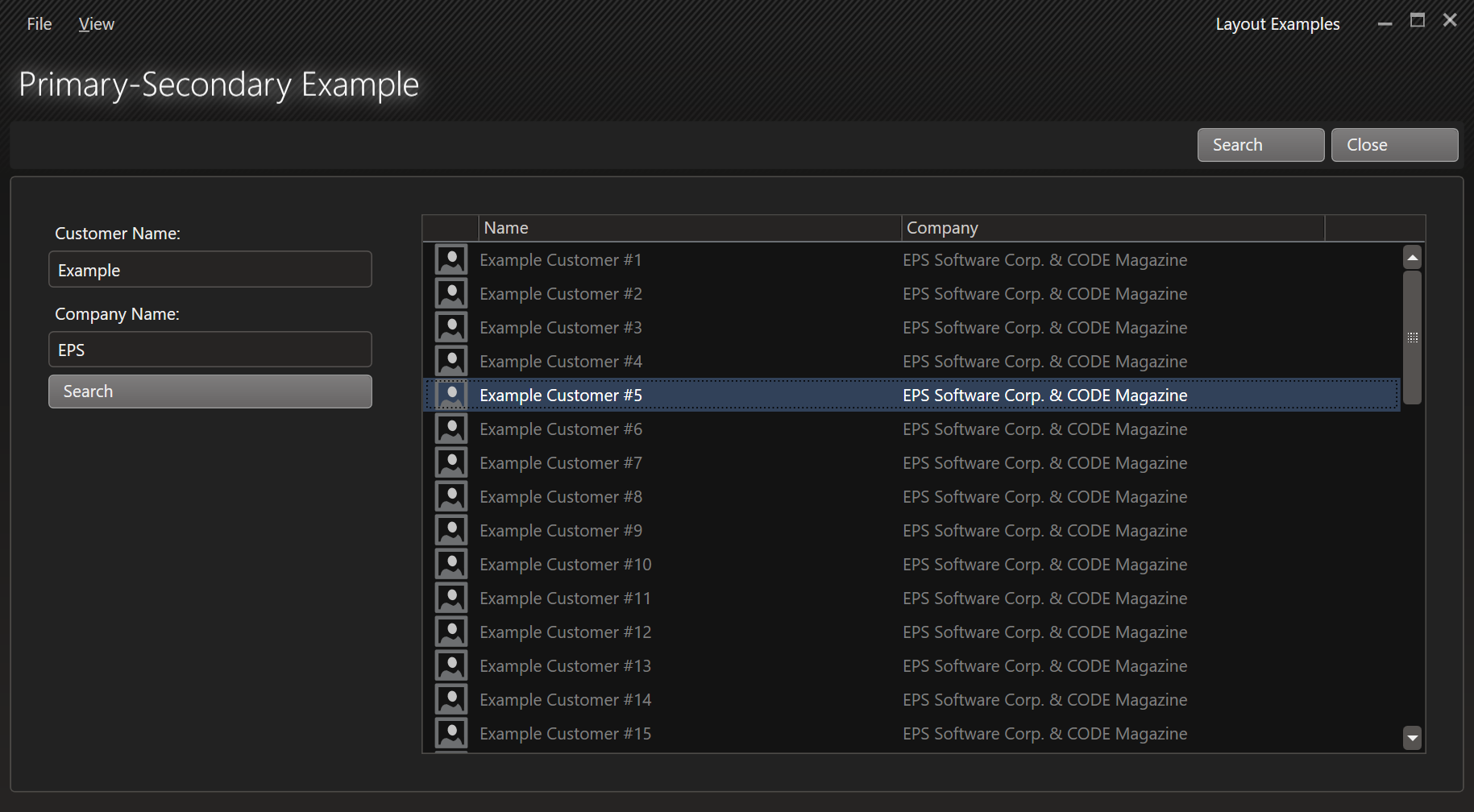
Figure 23: A Primary/Secondary search UI using the Vapor theme.
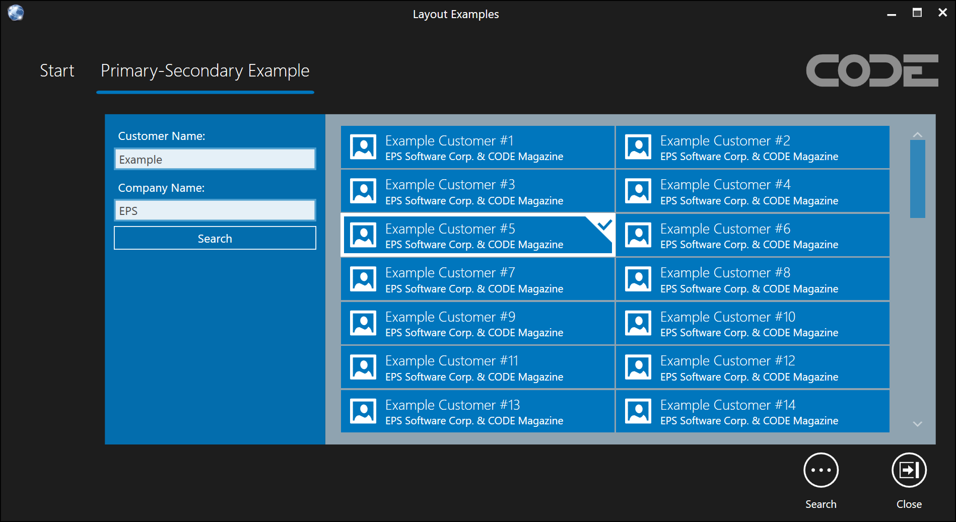
Figure 24: The same search UI as shown in Figure 23, but this time using the Metro theme. Note the different background colors used by the primary and secondary parts of the UI.
Primary/Secondary forms almost always use a View element to be invoked. (It is possible to use the primary/secondary layout element directly, but this is almost never done, which is why I am not covering it in this article). Here is the code for the examples shown in Figures 23 and 24:
<mvvm:View xmlns="http://schemas.microsoft.com/winfx/2006/xaml/presentation"
           xmlns:mvvm="clr-namespace:CODE.Framework.Wpf.Mvvm;assembly=CODE.Framework.Wpf.Mvvm"
           xmlns:controls="clr-namespace:CODE.Framework.Wpf.Controls;assembly=CODE.Framework.Wpf"
           Title="Primary-Secondary Example" StandardLayout="PrimarySecondaryListForm">

    <mvvm:View UIElementType="Secondary" StandardLayout="SimpleForm">
        <Label>Customer Name:</Label>
        <TextBox Text="{Binding Name}" />
        <Label>Company Name:</Label>
        <TextBox Text="{Binding Company}" />
        <Button Command="{Binding Actions[Search]}" Content="{Binding Actions[Search].Caption}"/>
    </mvvm:View>

    <ListBox mvvm:View.UIElementType="Primary" ItemsSource="{Binding SearchResults}"
             ItemTemplate="{DynamicResource CODE.Framework-StandardTemplate-DataSmall03}">
        <controls:ListEx.Columns>
            <controls:ListColumnsCollection>
                <controls:ListColumn BindingPath="Image1" Width="40" Header=""/>
                <controls:ListColumn BindingPath="Text1" Width="300" Header="Name"/>
                <controls:ListColumn BindingPath="Text2" Width="300" Header="Company"/>
            </controls:ListColumnsCollection>
        </controls:ListEx.Columns>
    </ListBox>

</mvvm:View>
The important part here is the use of the PrimarySecondaryListForm standard layout. There are four different variations of the primary/secondary layout: The default one and one for lists, which may or may not be different in some themes (Figure 24 shows how the Metro theme applies different colors to different parts, which the default variation would not do). Then there are equivalents of both with a “NoColor” suffix. Those, as the name implies, do not apply any background color. There is no behavioral difference between these. In most scenarios, primary/secondary forms deal with lists, so that is the most used version. The choice is simple: If your primary element is (or contains) a list, use the list one, otherwise, use the default one.
There are a few aspects about these forms to point out: Secondary elements may be arranged on any side of the main area, but it is usually to the left. Sometimes it is at the top. It can be right or at the bottom, but in Western cultures, that is not common. Be aware that the size of the secondary area is fixed. If this doesn’t suit your needs, consider using a blade-panel layout instead (with two panels and the second one filling the available space).
The primary/secondary panel layout has an interesting peculiarity: It is capable of swapping the position of the secondary element dynamically. For instance, if the element turns out to be very wide but now very tall, it may be positioned above the main element, but once the secondary element grows over a certain height, it snaps to the left. This behavior is driven by the SecondaryUIElementAlignmentChangeSize property. Take a look at an example definition of the style:
<Style TargetType="ItemsControl" x:Key="CODE.Framework-Layout-PrimarySecondaryFormLayout">
  <Setter Property="ItemsPanel">
    <Setter.Value>
      <ItemsPanelTemplate>
        <layout:GridPrimarySecondary Margin="20" UIElementSpacing="15" SecondaryUIElementAlignmentChangeSize="0" />
      </ItemsPanelTemplate>
    </Setter.Value>
  </Setter>
</Style>
Note that the change-size is set to 0. This always forces the secondary element to the left. However, if this size was set to something else (like 200 perhaps), then the secondary element would go to the top as long as it was less than 200 pixels tall. This behavior is sometimes confusing to people, but most themes force the change-height to 0, so it always is pushed to the side. It is easy to override that behavior by re-defining this style locally and change that behavior.
Property Sheet UIs
- Element name: PropertySheet
- XAML namespace declaration: clr-namespace:CODE.Framework.Wpf.Layout;assembly=CODE.Framework.Wpf
- Style key: n/a
- Standard layout: n/a
The UIs we have seen so far have all been concerned with the arrangement of large areas within a container. The property sheet layout element is the first one that concerns itself with laying out individual controls. The basic idea is to create something similar to a property sheet in Visual Studio. There are labels on the left and textboxes (or similar controls) on the right, creating a UI like the one shown in Figure 25.
Figure 25: A Property Sheet layout using the Geek theme.
Here is the code that goes with the definition of the UI in Figure 25:
<mvvm:View xmlns="http://schemas.microsoft.com/winfx/2006/xaml/presentation"
           xmlns:mvvm="clr-namespace:CODE.Framework.Wpf.Mvvm;assembly=CODE.Framework.Wpf.Mvvm"
           xmlns:l="clr-namespace:CODE.Framework.Wpf.Layout;assembly=CODE.Framework.Wpf"
           Title="Property Sheet Example" StandardLayout="StandardForm">

    <l:PropertySheet Padding="10">
        <TextBlock mvvm:View.GroupBreak="True" mvvm:View.GroupTitle="First Group">Test 1</TextBlock>
        <TextBox Text="Test 1 Text"/>
        <TextBlock>Test 2 is longer</TextBlock>
        <TextBox Text="Test 2 Text"/>
        <TextBlock>Test 3</TextBlock>
        <TextBox Text="Test 3 Text"/>

        <TextBlock mvvm:View.GroupBreak="True" mvvm:View.GroupTitle="Second Group">Second Group</TextBlock>
        <TextBox Text="Test 1 Text"/>
        <TextBlock>Test 2 is longer</TextBlock>
        <TextBox Text="Test 2 Text"/>

        <TextBlock mvvm:View.IsStandAloneLabel="True">Label only...</TextBlock>

        <TextBlock>Test 3</TextBlock>
        <TextBox Text="Test 3 Text"/>
        <TextBox mvvm:View.IsStandAloneEditControl="true" Text="Test 4 Text"/>

        <TextBlock>Example File:</TextBlock>
        <TextBox/>
        <Button Padding="5,0" Content="..." mvvm:View.FlowsWithPrevious="True"/>
        <Button Padding="5,0" Content="??" mvvm:View.FlowsWithPrevious="True"/>

        <Button mvvm:View.SpanFullWidth="True" Content="I span the entire width" />

        <TextBlock>One more</TextBlock>
        <TextBox Text="Okay"/>
    </l:PropertySheet>

</mvvm:View>
There are several points of interest in the UI shown in Figure 25. Most importantly, it demonstrates the basic idea behind a property sheet layout, which is to arrange elements with labels on the left and other controls on the right. The width of the widest label is used to calculate the width or all labels. The controls on the right always take up all the remaining space. (This is different to the EditForm behavior described below, where the controls define their own width).
The basic idea of the property sheet layout is simple, but the example in Figure 25 shows many more complex features. For instance, consider that the properties are shown in groups. This is done via the View.GroupBreak and View.GroupTitle attached properties. (Note: For property sheet layouts, it is required to indicate a group break even for the first element for group header rendering to kick in. This is so property sheets without grouping can be rendered if desired.)
The second group has some interesting arrangements of elements within itself. There is a label without a control on the right. This is done by setting the View.IsStandAloneLabel to true on the label control. Two rows further down, we have the opposite: A control without a label, thanks to the View.IsStandAlineEditControl property being set to true. The very next line shows several controls in the right-hand section. This is by creating controls that “flow with the previous” element, which is indicated by the View.FlowsWithPrevious property. Finally, we have a button that spans the entire available width, which is done using the View.SpanFullWidth property.
As you can see, the combination of all these controls gives us the ability to lay out a very advanced property sheet. And by the way: Remember all the attached View properties we encountered here (such as FlowsWIthPrevious), because those (and others) are used in even more complex scenarios, and we will meet them again in examples further below in this article.
Note: The property sheet is not considered a “standard CODE Framework layout”, and thus doesn’t have a predefined style and not StandardForm setting in the
Viewobject. This is not the only such element in CODE Framework, but it is relatively important (and may be elevated to standard layout status once all themes feature a default style for it), so I am mentioning it here anyway.
Edit Form UIs
- Element name: EditForm
- XAML namespace declaration: clr-namespace:CODE.Framework.Wpf.Layout;assembly=CODE.Framework.Wpf
- Style key: CODE.Framework-Layout-EditFormLayout
- Standard layout: EditForm
The EditForm UI is the Big Bertha of layout components. It is the most advanced, complex, and feature-rich generic layout component we have ever built (and quite likely anyone else, for that matter). The EditForm layout container is based on a relatively simple idea: Many data entry forms (“edit forms”) in business applications tend to use the same pattern: They lay out groups of labels and controls. There often is a label, followed by a control such as a textbox. Then there is the next label, and it is followed by another control, perhaps a drop-down list. The layout of these element is usually such that the labels and the controls are aligned to create a UI that is pleasing and easy to take in by the human eye. Figure 26 shows the most basic of such an example. The following code snippet creates that UI:
<l:EditForm>
  <TextBlock>Name:</TextBlock>
  <TextBox Width="300"/>
  <TextBlock>Company Name:</TextBlock>
  <TextBox Width="300"/>
  <TextBlock>Country of Origin:</TextBlock>
  <ComboBox Width="200"/>
</l:EditForm>
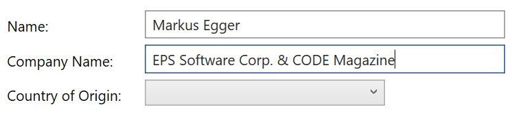
Figure 26: The most basic layout pattern of an EditForm: Text labels followed by a control. All the labels and all the controls are properly aligned.
This trivial example shows a few important concepts: For one, the EditForm container is smart enough to figure out which child elements are labels, and which are the “controls”. (The element on the left is always considered the "label" and the one on the right is considered the “edit control”, regardless of what actual type of element they are). Typically, this is done by making pairs of elements, but there are ways to change that (see below). Then, all the label elements are measured to see how wide they are. This then allows laying out all the controls in a fashion where all the labels and all the edit controls line up.
Note: the controls on the left-hand side of Figure 26 all have a specified hardcoded pixel width. It is better to set a more abstract width that grows and shrinks with font sizes and other factors. This can be done by setting the
View.WidthExattached property instead of the intrinsic Width property.
Of course, most edit form layouts are far more complex than this first example. Consider Figure 27 for a more advanced layout. In this example, the controls are arranged in groups (with displayed group headers). There also are two columns of control groups. Furthermore, the layout of the individual control “pairs” is now taken to the next level (and in fact demonstrates the ability to go beyond a simple pairings). For instance, there is a button to the right of the textbox after the "Company Name" label. Similarly, there are three textboxes for country, state, and ZIP code, all arranged to the right of a single label. On the opposite end of the spectrum, there is the “stand-alone” textbox for a second street below the first Street/textbox pairs.
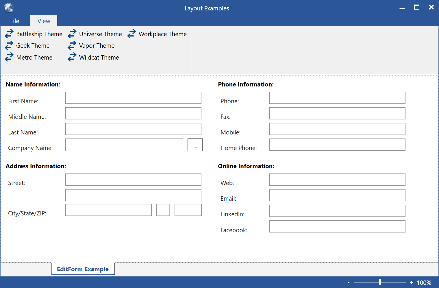
Figure 27: An advanced edit form layout.
How is this done? Here is the code snippet that creates that layout:
<l:EditForm>
    <Label mvvm:View.GroupTitle="Name Information:">First Name:</Label>
    <TextBox mvvm:View.WidthEx="30"/>
    <Label>Middle Name:</Label>
    <TextBox mvvm:View.WidthEx="30"/>
    <Label>Last Name:</Label>
    <TextBox mvvm:View.WidthEx="30"/>
    <Label>Company Name:</Label>
    <TextBox mvvm:View.WidthEx="26"/>
    <Button mvvm:View.FlowsWithPrevious="True">...</Button>

    <Label mvvm:View.GroupBreak="True" mvvm:View.GroupTitle="Address Information:">Street:</Label>
    <TextBox mvvm:View.WidthEx="30"/>
    <TextBox mvvm:View.WidthEx="30" mvvm:View.IsStandAloneEditControl="True"/>
    <Label>City/State/ZIP:</Label>
    <TextBox mvvm:View.WidthEx="19"/>
    <TextBox mvvm:View.WidthEx="3" mvvm:View.FlowsWithPrevious="True"/>
    <TextBox mvvm:View.WidthEx="6" mvvm:View.FlowsWithPrevious="True"/>

    <Label mvvm:View.ColumnBreak="True" mvvm:View.GroupTitle="Phone Information:">Phone:</Label>
    <TextBox mvvm:View.WidthEx="30"/>
    <Label>Fax:</Label>
    <TextBox mvvm:View.WidthEx="30"/>
    <Label>Mobile:</Label>
    <TextBox mvvm:View.WidthEx="30"/>
    <Label>Home Phone:</Label>
    <TextBox mvvm:View.WidthEx="30"/>

    <Label mvvm:View.GroupBreak="True" mvvm:View.GroupTitle="Online Information:">Web:</Label>
    <TextBox mvvm:View.WidthEx="30"/>
    <Label>Email:</Label>
    <TextBox mvvm:View.WidthEx="30"/>
    <Label>LinkedIn:</Label>
    <TextBox mvvm:View.WidthEx="30"/>
    <Label>Facebook:</Label>
    <TextBox mvvm:View.WidthEx="30"/>
</l:EditForm>
There is quite a bit of detail in this code snippet, so let’s take a look at them one by one. The first detail I want to draw your attention to is the setting of GroupTitle and GroupBreak attached properties. The EditForm panel can render group headings without there being any actual controls representing those. In other words: The first element within this UI is the label that says "First Name:". The group title is simply picked up from the View.GroupTitle property. If it is set (and we are either at a group break or at the very first control), then the EditForm will make space for a heading and render it. Group titles are optional, even if you want group breaks. If there is no title, the break will simply add a bit of space before the control. (Note: there are a number of properties on the EditForm to set break spacing and also features like fonts and colors for the headers. In the different themes, there are appropriate default for those settings, so they almost never have to be set manually.)
The third group of controls starts with a special feature: It creates a column break. Column breaks are special group breaks (they are considered a group break in terms of rendering a group header) that force the next element to flow to the column and start over at the very top. There is a property that defines the column spacing.
For special control alignment, take a look at the “...” button. The reason it is positioned to the right of the textbox (and thus ends up putting two control to the right of the label) is that it "flows with the previous" control. Thus, its View.FlowsWithPrevious attached property is set to true. (Note: We have already seen this feature with the PropertySheet control). The same feature is used with the city/state/zip control alignment. In this case, two textboxes are set to flow with the previous control.
Finally, we have the textbox to enter a second street address. It has no label. It stands on its own. It is therefore considered a “stand-alone edit control”, which is indicated by the View.IsStandAloneEditControl property. (Note: There also is an equivalent for a stand-alone label).
Using this set of features, one can create many different edit forms. Most of the time, all other features are set to appropriate defaults by themes and styles. Therefore, the same UI is usually just defined by means of a View with a StandardLayout applied:
<mvvm:View xmlns="http://schemas.microsoft.com/winfx/2006/xaml/presentation"
           xmlns:mvvm="clr-namespace:CODE.Framework.Wpf.Mvvm;assembly=CODE.Framework.Wpf.Mvvm"
           Title="EditForm Example" StandardLayout="EditForm">
    <Label mvvm:View.GroupTitle="Name Information:">First Name:</Label>
    <TextBox mvvm:View.WidthEx="30"/>
    <Label>Middle Name:</Label>
    <TextBox mvvm:View.WidthEx="30"/>
    <Label>Last Name:</Label>
    <TextBox mvvm:View.WidthEx="30"/>
    <Label>Company Name:</Label>
    <TextBox mvvm:View.WidthEx="26"/>
    <Button mvvm:View.FlowsWithPrevious="True">...</Button>

    <Label mvvm:View.GroupBreak="True" mvvm:View.GroupTitle="Address Information:">Street:</Label>
    <TextBox mvvm:View.WidthEx="30"/>
    <TextBox mvvm:View.WidthEx="30" mvvm:View.IsStandAloneEditControl="True"/>
    <Label>City/State/ZIP:</Label>
    <TextBox mvvm:View.WidthEx="19"/>
    <TextBox mvvm:View.WidthEx="3" mvvm:View.FlowsWithPrevious="True"/>
    <TextBox mvvm:View.WidthEx="6" mvvm:View.FlowsWithPrevious="True"/>

    <Label mvvm:View.ColumnBreak="True" mvvm:View.GroupTitle="Phone Information:">Phone:</Label>
    <TextBox mvvm:View.WidthEx="30"/>
    <Label>Fax:</Label>
    <TextBox mvvm:View.WidthEx="30"/>
    <Label>Mobile:</Label>
    <TextBox mvvm:View.WidthEx="30"/>
    <Label>Home Phone:</Label>
    <TextBox mvvm:View.WidthEx="30"/>

    <Label mvvm:View.GroupBreak="True"  mvvm:View.GroupTitle="Online Information:">Web:</Label>
    <TextBox mvvm:View.WidthEx="30"/>
    <Label>Email:</Label>
    <TextBox mvvm:View.WidthEx="30"/>
    <Label>LinkedIn:</Label>
    <TextBox mvvm:View.WidthEx="30"/>
    <Label>Facebook:</Label>
    <TextBox mvvm:View.WidthEx="30"/>
</mvvm:View>
However, there are quite a few additional settings developers can fiddle with. This is usually done by changing the app-global definition of the layout style, or by overriding the style in the resource dictionary of a specific view. (See the first part of this article for more information on how to accomplish these tasks). I will discuss each setting individually below, but for now, I will draw your attention to a few additional key features. The first one is the ability to change where the label goes. Some themes call for a label on the left (as shown in Figure 27), while others (such as the Metro and Universe themes) position the label above the edit controls. This is set through the LabelPositions property.
A very sophisticated feature of the EditForm layout element is called “layout elasticity”. This refers to the ability to smartly adjust the layout to take advantage of available screen real-estate. Figure 27 shows a UI that offers plenty of room for all the controls that need to be positioned on the screen. However, if the user resizes the window smaller, not all controls will fit anymore. At that point, the EditForm has the capability to shrink spacing between controls down to a configurable minimum level. Figure 28 shows the same UI rendered at slightly different sizes to illustrate the point. Pay close attention to the spacing between controls and columns. Layout elasticity can take things a step further yet and apply scale transformations to scale the entire UI. This however is a specialty scenario that is only used by some themes. No matter which approach is used to shrink the UI, eventually the space available is going to get too small to fit everything. At that point, the EditForm shows scrollbars. Specifics of layout elasticity are set through the LayoutElasticity property on the EditForm element.
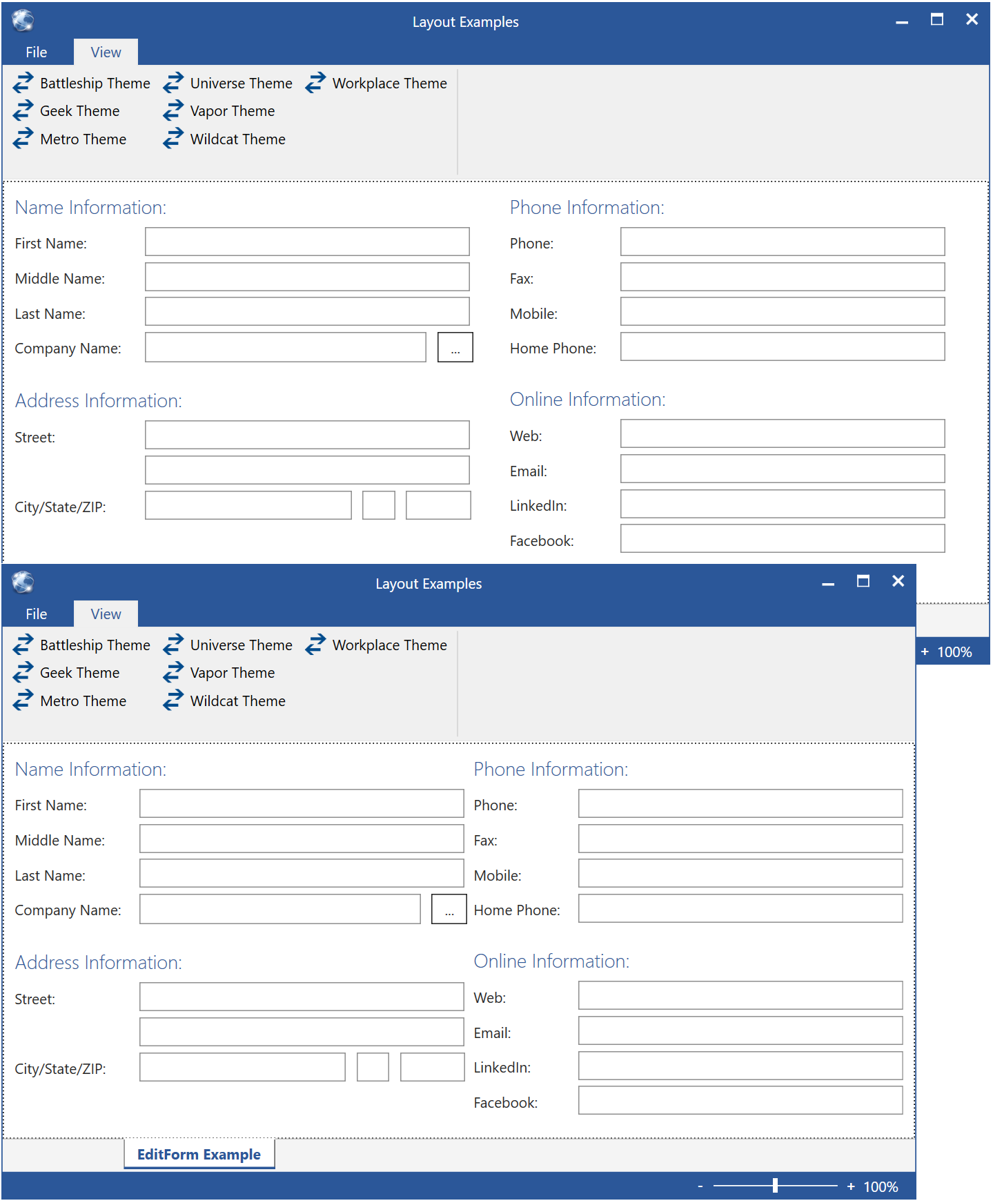
Figure 28: The same UI shown at slightly different sizes and resulting in subtle but important differences. Due to layout elasticity, the spacing between controls and columns is shrunk in the bottom example.
Another feature that is worth mentioning is the ability to render additional visual indicators into the background. One such option is to draw boxes or backgrounds around groups. Figure 29 shows this in action. This is done by setting the RenderGroupBackground property of the EditForm to true. Furthermore, there are settings for background and border brushes, as well as border thickness. A similar option allows rendering horizontal lines after each control. This feature can be enabled through the RenderHorizontalControlSeparatorLines property (and associated properties for desired colors). Figure 30 shows what this feature is capable of. In that example, both the left and the right side happen to be TextBlock elements (the one on the right happens to be in bold). All the horizontal lines are rendered by the container element.
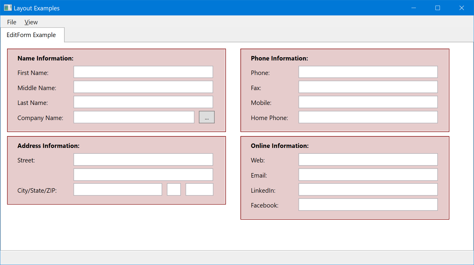
Figure 29: Backgrounds and borders rendered for each group in an edit form layout.
Figure 30: An edit form layout composed out of textblocks. It is using horizontal separator lines and group headers.
As you can see in these examples, there are two sets of properties that impact edit form layouts: 1) properties in the EditForm element itself, and 2) attached properties on the View object. Let’s take a full inventory of all those properties, starting with the EditForm element’s properties:
- ColumnSpacing: Defines the horizontal space between columns.
- EditControlLeftSpacing: Defines the space added to the left of edit controls, after the widest label. Only applies when the label is positioned to the left of the edit control.
- EditControlTopSpacing: Spacing between the label and edit control, when the label is positioned above the edit control.
- FlowWithPreviousSpacing: Defines the horizontal spacing between edit controls when a second control flows in behind the previous control.
- GroupBackgroundBrush: Background brush used to render group backgrounds. Only applies when RenderGroupBackground is true.
- GroupBorderBrush: Border brush used to render group backgrounds. Only applies when RenderGroupBackground is true and the border width is greater than zero.
- GroupBorderMargin: Margin added around groups when group backgrounds are rendered. This defines the margin/padding between the edge of the rendered background and the actual controls within it. Only applies when RenderGroupBackground is true.
- GroupBorderWidth: Defines the width of the border rendered for group backgrounds. Only applies when RenderGroupBackground is true.
- GroupHeaderBottomSpacing: Spacing added blow the text, when rendering group headers.
- GroupHeaderFontFamily: Font family used for group headers.
- GroupHeaderFontSize: Font size used for group headers.
- GroupHeaderFontStyle: Font style used for group headers.
- GroupHeaderFontWeight: Font weight used for group headers.
- GroupHeaderForegroundBrush: Foreground brush used for group headers.
- GroupHeaderRenderer: Allows defining a customer renderer object to render group headers. This can be used to create custom renderings of any kind for group headers. This can be used to render text-based headers, or any kind of other rendering output imaginable.
- GroupHeaderTopSpacing: Spacing added above the text, when rendering group headers.
- GroupSpacing: Defines the (typically vertical) spacing between groups.
- HorizontalLineSeparatorBrush: Brush used to render horizontal separator lines between controls.
- LabelPositions: Defines whether labels are positioned to the left or above the controls.
- LayoutElasticity: Defines the layout elasticity behavior (none, spacing, spacing&scale). See above for more detail.
- MinColumnSpacing: Defines the minimum column spacing layout elasticity can shrink down to (assuming layout elasticity is enabled).
- MinEditControlLeftSpacing: Defines the minimum control spacing layout elasticity can shrink down to (assuming layout elasticity is enabled).
- MinElasticScaleFactor: Defines the minimum scale layout elasticity can shrink down to (assuming layout elasticity is enabled).
- MinGroupHeaderBottomSpacing: Defines the minimum header bottom spacing layout elasticity can shrink down to (assuming layout elasticity is enabled).
- MinGroupHeaderTopSpacing: Defines the minimum header top spacing layout elasticity can shrink down to (assuming layout elasticity is enabled).
- MinGroupSpacing: Defines the minimum group spacing layout elasticity can shrink down to (assuming layout elasticity is enabled).
- MinVerticalSpacing: Defines the minimum vertical control spacing layout elasticity can shrink down to (assuming layout elasticity is enabled).
- RenderGroupBackground: Defines whether group backgrounds should be rendered. If this is set to false, all settings for group background properties are ignored.
- RenderHorizontalControlSeparatorLine: Defines whether horizontal separator lines are to be rendered. If this is set to false, all settings for horizontal separator line rendering are ignored.
- ScrollBarMode: Defines whether and what scrollbars shall be shown if needed (none, horizontal, vertical, both).
- VerticalControlSeparatorOffset: Defines how far below the control a potential separator line is to be shown.
- VerticalLabelControlOffset: The label elements (the elements on the left) often do not line up very nicely with the top-edge of the edit controls. Using this property, a vertical offset for the label element can be fine-tuned.
- VerticalSpacing: Vertical spacing between layout elements.
In addition to these EditForm properties, the control also respects the following attached properties from the View object:
- View.ColumnBreak: Indicates a column break. (Column breaks are also considered “group breaks” implicitly).
- View.FlowsWithPrevious: Indicates that an element is to flow to the right of the previous element. This is only supported on the “edit control” side of the arrangement.
- View.GroupBreak: Indicates a group break.
- View.HeightEx: Can be used to set the height of an element in a way that is relative to the current font size. (1 = fits about the height of a single line of text)
- View.IsStandAloneEditControl: Indicates that the element is to be considered an edit control (right side) even though there is no label. The space of the label remains empty.
- View.IsStandAloneLabel: Indicates that the element is a label and there is no following edit control. The space for the edit control remains empty.
- View.Label: This can be used to generically define a label on the edit control. The label will automatically be rendered without the need of an actual label object.
- View.LabelFontFamily: Font family for the label. Only applies if the
View.Labelproperty is set. - View.LabelFontSize: Font size for the label. Only applies if the
View.Labelproperty is set. - View.LabelFontStyle: Font style for the label. Only applies if the
View.Labelproperty is set. - View.LabelFontWeight: Font weight of the label. Only applies if the
View.Label property is set. - View.LabelForegroundBrush: Foreground brush for the label. Only applies if the
View.Labelproperty is set. - View.WidthEx: Can be used to set the width of an element in a way that is relative to the current font size. (1 = fits about the width of an average character )
Flow Form UIs
To be completed…