Auto-Complete in WPF UIs
Excerpt from an internal email at CODE:
FYI: Recently, Thom asked me to help him create an auto-complete UI for a client. He was looking for a control he could use for the purpose. After looking for some solutions, none of which was really appealing, we decided to add an auto-complete feature to CODE Framework’s WPF controls.
We came up with a pretty cool solution. We created attached properties, which allows us to turn any control into a control that supports auto-complete. For instance, if you have a textbox that has a customer name and you want to show a list of matches to create a UI like this:
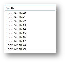
The idea here is that you have this bound textbox and can then say “I want this to support auto-complete” and to populate the auto-complete drop down list, you specify the items source for that (binding). When the user selects an item from the list, that item gets put into another property in the view model. The definition of the above textbox looks like this:
<TextBox Text="{Binding CustomerName, UpdateSourceTrigger=PropertyChanged}"
         my:AutoComplete.AutoCompleteItemsSource="{Binding CustomersAutoComplete}"
         my:AutoComplete.AutoCompleteDisplayMemberPath="FullName"
         my:AutoComplete.AutoCompleteSelectedItem="{Binding SelectedAutoCompleteCustomer, Mode=TwoWay}" />
The associated properties in the view model look like this:
private string _customerName;
public string CustomerName
{
    get { return _customerName; }
    set
    {
        _customerName = value;
        NotifyChanged("CustomerName");
        CustomersAutoComplete.Clear();
        if (!string.IsNullOrEmpty(value))
            for (int i = 0; i < 10; i++)
                CustomersAutoComplete.Add(
                    new CustomerQuickInformation
                        {
                            FirstName = "Thom",
                            LastName = value + " #" + i
                        });
    }
}

private CustomerQuickInformation _selectedAutoCompleteCustomer;
public CustomerQuickInformation SelectedAutoCompleteCustomer
{
    get { return _selectedAutoCompleteCustomer; }
    set
    {
        _selectedAutoCompleteCustomer = value;
        CustomerName = value.FullName;
        NotifyChanged();
    }
}

public ObservableCollection<CustomerQuickInformation> CustomersAutoComplete { get; set; }
Of course the idea here would be that you would go to some sort of data source to populate the items in the CustomersAutoComplete collection, rather than hard-coding it like I did in my example. But you get the idea.
There are a few things that are really cool about this setup. For one, as mentioned above, this is not specific to a control, but you can attach this behavior to any control, simply by setting the auto-complete attached properties. Cool, hm? The other thing that is really cool is that the drop-down part of the auto-complete is basically a listbox that is completely stylable. For instance, I created another auto-complete UI that allows the user to enter folder and file names and the drop-down part shows the associated contents in a nice way:
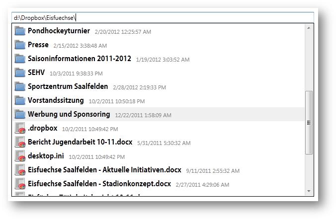
In this case, the view model simply searches for the files entered and puts them into a collection the auto-complete drop-down is bound to. I also do a bit of extra work to show a folder icon or a file icon. Plus, I am showing the file date. This goes to show that you can have very rich content in the drop-down. You can basically do whatever you want.
Here’s the code for the textbox:
<TextBox Text="{Binding File, UpdateSourceTrigger=PropertyChanged}"
         my:AutoComplete.AutoCompleteItemsSource="{Binding FilesAutoComplete}"
         my:AutoComplete.AutoCompleteSelectedItem="{Binding SelectedAutoCompleteFile, Mode=TwoWay}">
    <my:AutoComplete.AutoCompleteItemTemplate>
        <DataTemplate>
            <Grid my:GridEx.ColumnWidths="Auto,Auto,Auto">
                <Rectangle Height="24" Width="24" Margin="1" Fill="{DynamicResource FolderIcon}" Visibility="{Binding FolderVisible, Mode=OneWay}" />
                <Rectangle Height="24" Width="24" Margin="1" Fill="{DynamicResource FileIcon}" Visibility="{Binding FileVisible, Mode=OneWay}" />
                <TextBlock Text="{Binding FileName}" FontSize="14" FontFamily="Adobe Gothic Std B" Grid.Column="1" Margin="3,0,0,0" VerticalAlignment="Bottom" />
                <TextBlock Text="{Binding Date}" FontSize="11" Margin="10,0,10,5" VerticalAlignment="Bottom" Grid.Column="2" Foreground="Gray" />
            </Grid>
        </DataTemplate>
    </my:AutoComplete.AutoCompleteItemTemplate>
</TextBox>
This is the kind of thing that looks like it should be really hard to do, but it really isn’t. As long as you are familiar with styling items in a listbox, you are good to go. (And if not, make sure you read my listbox styling article!!!). In fact, if you are familiar with styling of listboxes, you can totally go to town on this. Consider this next example, where I also changed the layout of the listbox items and I also show a preview image if the file in the drop down is an image:
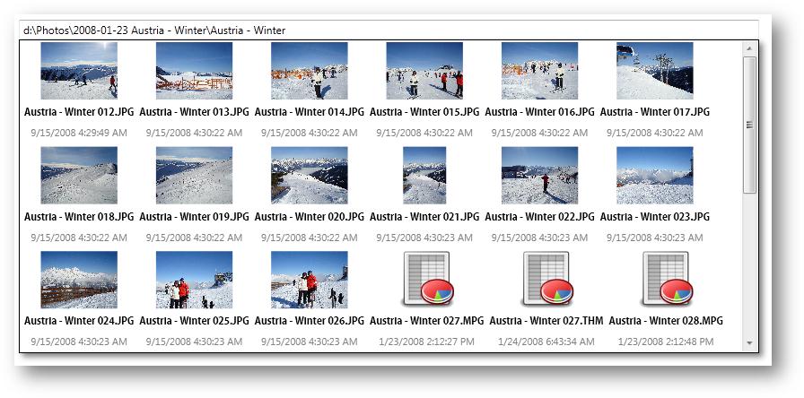
Pretty cool, huh?
The code here is a little more involved (and you can find all of this in the source of the CODE Framework under the test bench app and the AutoCompleteTest.xaml file):
<TextBox Margin="25,0,25,370"
         Text="{Binding File, UpdateSourceTrigger=PropertyChanged}"
         my:AutoComplete.AutoCompleteItemsSource="{Binding FilesAutoComplete}"
         my:AutoComplete.AutoCompleteSelectedItem="{Binding SelectedAutoCompleteFile, Mode=TwoWay}"
         Height="22" VerticalAlignment="Bottom">
    <my:AutoComplete.AutoCompleteItemTemplate>
        <DataTemplate>
            <Grid my:GridEx.RowHeights="Auto,Auto,Auto">
                <Rectangle Height="64" Width="64" Margin="1" Fill="{DynamicResource FolderIcon}" Visibility="{Binding FolderVisible, Mode=OneWay}" />
                <Rectangle Height="64" Width="64" Margin="1" Fill="{DynamicResource FileIcon}" Visibility="{Binding FileVisible, Mode=OneWay}" />
                <Rectangle Height="64" HorizontalAlignment="Stretch" Margin="1" Fill="{Binding PreviewImage}" Visibility="{Binding PreviewVisible, Mode=OneWay}" />
                <TextBlock Text="{Binding FileName}" FontSize="11" FontFamily="Adobe Gothic Std B" Grid.Row="1" Margin="2" HorizontalAlignment="Center" />
                <TextBlock Text="{Binding Date}" FontSize="11" Margin="2,2,2,8" Grid.Row="2" Foreground="Gray" HorizontalAlignment="Center" />
            </Grid>
        </DataTemplate>
    </my:AutoComplete.AutoCompleteItemTemplate>
    <my:AutoComplete.AutoCompleteStyle>
        <Style TargetType="my:AutoComplete">
            <Style.Resources>
                <SolidColorBrush x:Key="{x:Static SystemColors.InactiveSelectionHighlightBrushKey}" Color="Red" Opacity=".33" />
            </Style.Resources>
            <Setter Property="Effect">
                <Setter.Value>
                    <DropShadowEffect Opacity=".5" BlurRadius="10" />
                </Setter.Value>
            </Setter>
            <Setter Property="MaxHeight" Value="350" />
            <Setter Property="ScrollViewer.HorizontalScrollBarVisibility" Value="Disabled" />
            <Setter Property="ItemsPanel">
                <Setter.Value>
                    <ItemsPanelTemplate>
                        <WrapPanel ScrollViewer.HorizontalScrollBarVisibility="Disabled" />
                    </ItemsPanelTemplate>
                </Setter.Value>
            </Setter>
        </Style>
    </my:AutoComplete.AutoCompleteStyle>
</TextBox>
This is a little longer, but really not very complex. You can simply set the style of the auto complete drop down, and once you get that, you can do whatever you want. In my case, the main thing is that I set the ItemsPanelTemplate to a WrapPanel, which creates the flowing layout of items.