Metro-Style Control Margins and Layout
This is an excerpt from an internal email at CODE:
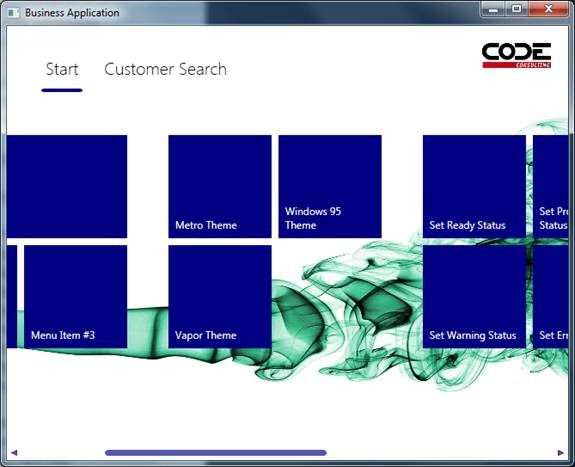
We have made a minor but important change in how views are positioned in Metro. Consider the following screen shot:
Note that there is quite a bit of spacing to the left of the blue area (116 pixels to be exact, which is Metro standard).
In the past, this was achieved by setting the margin on the view’s style. Now, the margin on the view itself should not be set anymore. Instead, the Shell (main window) positions loaded views using that margin. So do not set that margin in custom view styles, otherwise you will end up with a double margin.
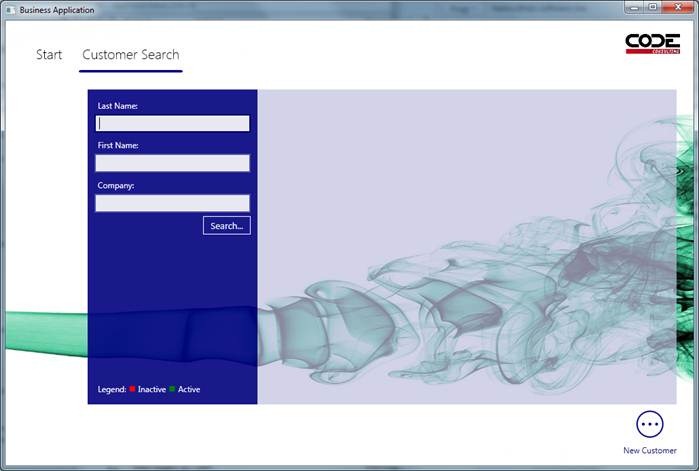
Note that the new approach is also a bit smarter about how it applies the margin. In Windows 8, Metro apps are always at least 1024 pixels wide. Metro style WPF apps can be made smaller. When they are smaller, the “waste” of those 116 pixels starts to hurt. Our style is thus smart and starts to reduce that margin when the window is realized smaller. So this is kind of another type of “elasticity”. Here’s what the same screen looks like when the window is smaller.
Note that the margin on the left has now disappeared.
On another, related change, I have now changed the way tiles scroll horizontally. In the past, there was always a left margin even when scrolling like this:
Note how the scrollbar at the bottom has a left margin and tiles will never scroll over all the way to the left edge. This has now been changed. While tiles should start out with a left margin of 116 pixels in Metro start screens, they are supposed to scroll all the way over once the user scrolls manually. This is now implemented correctly: