Checked and Toggle View-Actions
View-Actions in CODE Framework have an IsChecked property that can be used to indicated a “checked”, "selected", or “activated” state. For instance, this could be used to show a check-mark next to a menu item that represents a view-action.
To create a checked view action, simple set the IsChecked property on the view-action:
new ViewAction() {IsChecked = true};
This fundamentally creates such an action, and one can then use the property as desired. However, most themes only do anything with the IsChecked flag when the view action type is set to “Toggle”:
new ViewAction() {IsChecked = true, ViewActionType = ViewActionTypes.Toggle};
This is required for the framework to differentiate between an action that is supposed to be capable of having a checked indicator (even if IsChecked = false), and an action that just happens to not be currently checked, but has no built-in logic to ever check it (in menu scenarios, this could lead to showing an icon where otherwise, a check-mark may be displayed).
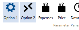
It is up to each theme (or custom component) to make use of the IsChecked flag. For instance, Ribbon controls may show a checked action like this (image from a Workplace-themed app). In this example, the first two elements are toggle view actions with IsChecked = true:
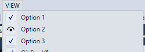
Or, the same could show up in a menu (image from a Geek-themed app). In this example, items 1 and 3 are checked:
One of the nice convenience features is that the default ViewAction implementation also features a IsChecked_Visible property, which returns Visible (for IsChecked = true) and Collapsed (for IsChecked = false). This makes it very convenient to bind anything that needs to be hidden and displayed based on whether an action has a checked flag. Furthermore, there is a special default ViewAction called ToggleViewAction, which will automatically toggle the IsChecked property every time the action is executed. (Note: Whatever execute-delegate is passed to a ToggleViewAction is executed in addition to flipping the IsChecked flag). Using these convenience features, one can create a simple setup like this:
public class MyViewModel : ViewModel
{
    public MyViewModel()
    {
        Actions.Add(new ToggleViewAction(“Output”));
    }
}
This view-action can now be used to toggle a hypothetical UI element on and off. In XAML, we could simply add the following element:
<ListBox Visibility=”{Binding Actions[Output].IsChecked_Visible}” />
Note: This uses the string-indexer of the Actions collection in the binding path, which is a very convenient way to reference generic actions. (See also: String Indexer for ViewActionsCollection)