Automatic Layout - Multi Panel
Excerpt from an internal email at EPS/CODE:
CODE Framework features a layout panel called MultiPanel. The MultiPanel is an element you can use as a container in WPF apps to get some automatic layout behavior. So it is similar in that sense to a Grid object or a StackPanel. Except, it does much more sophisticated and useful layout.
Here’s an example: Imagine you have a UI that has multiple main areas. Perhaps a bunch of grids or something like that. And those areas are potentially turned on and off. For instance, imagine a list of customers and when you click one, you see a list of orders, and when you click on one of those, a list of order details appears, resulting in a screen with 3 different lists (or whatever other element you would like to use) appearing at the same time.
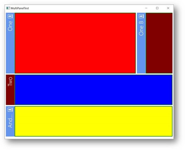
The following test bench screen shot shows such a scenario in a very simple test bench, where a bunch of colored rectangles represent the “UI Elements”:
Note: Of course this is just a silly example. Imagine the rectangles being fancy UIs, such as lists of data, or charts, or entire edit forms, or whatever.
In this case, it is 4 different elements (and one even doing a little extra trickery by being positioned over on the right edge in the first “row”. Here’s the XAML that creates this:
<l:MultiPanel Orientation="Vertical">
  <Rectangle mvvm:View.Title="One" mvvm:View.Closable="True" mvvm:View.RelativeHeight="2*"
     Fill="Red" Stroke="Green" StrokeThickness="2"/>
  <Rectangle mvvm:View.Title="One B" mvvm:View.Closable="True" Fill="Maroon" Stroke="Green"
     StrokeThickness="2" mvvm:View.FlowsWithPrevious="True" Width="150"/>
  <Rectangle mvvm:View.Title="Two" mvvm:View.TitleColor="Maroon" mvvm:View.SupportsDocking="True"
     Fill="Blue" Stroke="Green" StrokeThickness="2"/>
  <Rectangle mvvm:View.Title="And Three" mvvm:View.Closable="True" Fill="Yellow" Stroke="Green"
     StrokeThickness="2"/>
</l:MultiPanel>
If you look at this closely, there isn’t much going on here. It’s just a MultiPanel control that contains a few rectangles with fill colors and outlines. But there are a whole bunch of other properties set that aren’t standard, so that is where things get interesting 😃.
Fundamentally though, we use a MultiPanel of Vertical Orientation (which is the default, so we would not need to set that explicitly). If the orientation was Horizontal, it would look like this:
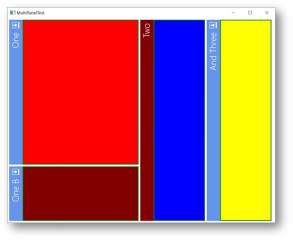
So as you can see, this changes the general orientation for the elements to be one after the other from left-to-right.
By default, the control just takes all the children, calculates the available space, and sizes the elements so they take up all the available space, with each control getting an equal share. But this can be influenced. As you can see in the code snippet above, there are attached properties that set the width of each element. This basically works like in a Grid, so you can set the Width/Height to -values (like * or 2 or 3.5*) or to Auto (sizes to the content) or to a fixed pixel width. This is why the red boxed as twice as tall (or wide, in the second example) than the other elements.
Also, the maroon box is interesting, because it breaks out of the standard layout. This is because it has the FlowsWithPrevious property set to true, which instructs the layout engine to flow that element into the current row (vertical layouts) or column (horizontal layouts). That’s quite useful in a lot of cases.
Another property of interesting is Closable=”True”, which indicates that the element can be closed out. You can see that some of the headers have icons that if you click, cause the panel to close (or, if there is a CloseAction set, then it calls that command when the icon is clicked). The icon is the theme’s default close icon, btw (at least by default) and will thus change with the theme and thus look right wherever you use this.
Talking about the headers: Where did they come from?!? After all, our rectangles and our code snippet had nothing that would create those headers and title.
For one, there is a property called Title, which when set, can be used to display a header for each contained element. Then, the MultiPanel class allows for a stylable header renderer object to be set, which, if present, can render headers. The above XAML snippet was actually abbreviated, and the full definition of the MultiPanel goes like this:
<l:MultiPanel Orientation="Horizontal">
  <l:MultiPanel.HeaderRenderer>
    <l:MultiPanelHeaderRenderer Background="CornflowerBlue" Foreground="White"
      FontSize="24" Orientation="Vertical" FontWeight="Light">
      <l:MultiPanelHeaderRenderer.CloseIcon>
        <DrawingBrush Stretch="Uniform">
          <DrawingBrush.Drawing>
            <DrawingGroup>
              <DrawingGroup.Children>
                <GeometryDrawing Brush="White" Geometry="F1 M 14.2875,0L 17.15,0L 17.15,14.2969L 14.2875,14.2969L 14.2875,0 Z  Z "/>
                <GeometryDrawing Brush="White" Geometry="F1 M 12.3844,14.2969L 0,14.2969L 0,0L 12.3844,0L 12.3844,0.956238L 0.946873,0.956238L 0.946873,13.35L 12.3844,13.35L 12.3844,14.2969 Z "/>
                <GeometryDrawing Brush="White" Geometry="F1 M 7.61875,8.57501L 2.85312,8.57501L 2.85312,5.72186L 7.61875,5.72186L 7.61875,2.86249L 12.3844,7.15936L 7.61875,11.4469L 7.61875,8.57501 Z "/>
              </DrawingGroup.Children>
            </DrawingGroup>
          </DrawingBrush.Drawing>
        </DrawingBrush>
      </l:MultiPanelHeaderRenderer.CloseIcon>
    </l:MultiPanelHeaderRenderer>
  </l:MultiPanel.HeaderRenderer>
This is long-winded, but it is the super-duper version of a customized header. Fundamentally, it just says that the header renderer for the MultiPanel is set to a MultiPanelHeaderRenderer object (which ships with the framework… but you could also hand-code your own). It has the default background color set (note that not all headers have the same color, because the colors can also be set on each element). It also sets font and such. And then this defines a custom close icon (which is the majority of the code and doesn’t have to be done by default, but I wanted to show the example).
So there you have it! This creates the headers that go with each element. You can use them if you want, but they are optional. They are however also useful for one more feature: Docking and undocking of elements. You may notice that some of the objects have SupportsDocking set to true, which means that you can grab the header and undock the element, which could then result in something like this:
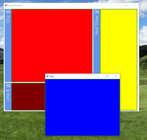
In this case, the blue rectangle has been grabbed with the mouse and undocked and floated around the screen (and resized a bit). Note that the header is now gone and instead the title is the Window title. The whole window itself can be styled as well through the header renderer’s DockWindowStyle property. So this can look like anything you want (and should generally look right for the theme you are using without having to customize anything).
So that is all quite useful. You can use this layout panel directly, as in the code sample above, or you can use it as the ItemsPanelTemplate for a CODE Framework View class (or any other items control for that matter). In fact, the next CODE Framework build has quite a few enhancements to specifically support things like docking in styled layout, rather than just when using the element directly.