Multi-Column Lists
All CODE Framework WPF components expose the ability to generically define columns on any type of list object. This is especially useful on listboxes, which can thus be used in a fashion very similar to data grids, without giving up the flexibility provided by listboxes.
The fundamental idea is to define listboxes (or other lists) and declaratively state which columns one desires. Here is an example:
<ListBox>
  <c:ListEx.Columns>
    <c:ListColumnsCollection>
      <c:ListColumn BindingPath="Text1" Header="Text 1" IsResizable="True" Width="200" />
      <c:ListColumn BindingPath="Text2" Header="Text 2" IsResizable="True" Width="100" />
      <c:ListColumn BindingPath="Text3" Header="Text 3" IsResizable="True" Width="250" />
      <c:ListColumn BindingPath="Text4" Header="Text 4" IsResizable="True" Width="150" />
      <c:ListColumn BindingPath="Text5" Header="Text 5" IsResizable="True" Width="200" />
    </c:ListColumnsCollection>
  </c:ListEx.Columns>
</ListBox>
Note: Column definitions also support item template definitions, allowing the developer to define completely arbitrary column contents, including interactive controls, such as textboxes within columns.
Note: The Width property of each column can be defined as absolute pixel widths, or as star-notation based proportions. Pixel and star notations can be mixed and matched. This works identical to how a Grid object in WPF defined column widths, except that the listbox column notation doesn't support “auto”.
The definition of these columns by itself only expresses the intent to have these columns. Whether these columns actually show up in any way (and how specifically) depends on the applied style. Default WPF controls would completely ignore this information. However, CODE Framework provides multiple styles, some of which are automatically implied while others are explicitly chosen, which respect these definitions and thus show listboxes with appropriate columns.
Example: If you build a CODE Framework WPF application that uses the Battleship (Windows 95) style, the implicit (automatic) listbox style respects columns. Thus, the above listbox using the Battleship style looks like this:
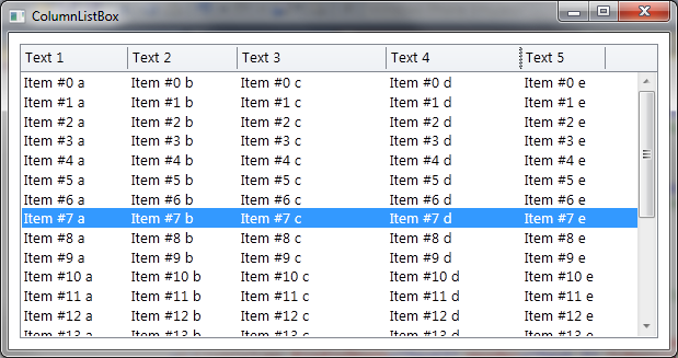
Note that these styles are quite functional. For instance, one of the cool features supported in this particular example is resizable columns (see definition above).
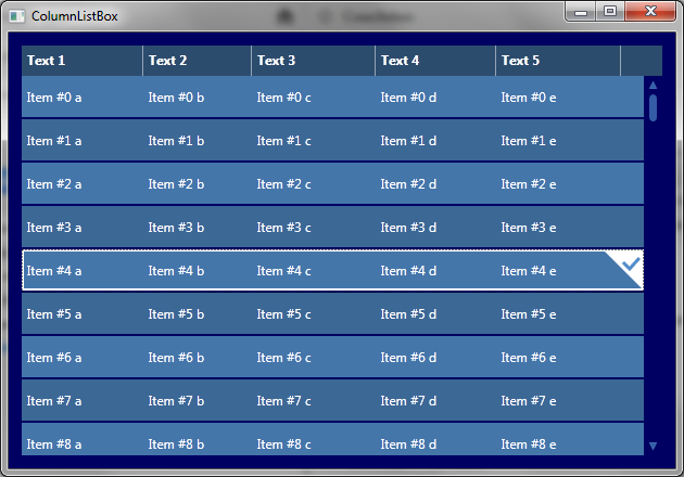
Other styles may choose to show their lists differently. Some may completely ignore columns. By default, Metro-style applications use “tiles” rather than columns for their lists, and thus ignore this information. It is however possible to use an explicit style even in Metro and force a multi-column list. All that’s needed for that is a small change in the listbox definition like so:
<ListBox Style="{DynamicResource Metro-Control-ListBox-Columns}"> …
In many real-life scenario it is suggested that this is done in a resource file, so this style is only set for Metro style apps but not for others.
The resulting UI looks like this (colors depend on the chosen theme colors of course):
Note that some default features in the framework (especially standard view templates in non-Metro themes) automatically take advantage of this feature.
Multi-column listboxes also support templates, both for individual items (cells) as well as headers. Consider the following column definitions:
<c:ListColumn BindingPath="Text4" Header="Text 4" IsResizable="True" Width="150">
<c:ListColumn.HeaderTemplate>
    <ControlTemplate>
      <Grid c:GridEx.RowHeights="Auto,*" HorizontalAlignment="Stretch">
        <TextBox>This is some text</TextBox>
        <Button Grid.Row="1">Button</Button>
      </Grid>
    </ControlTemplate>
  </c:ListColumn.HeaderTemplate>
</c:ListColumn>
And:
<c:ListColumn Header="Text 5" IsResizable="True" Width="200">
  <c:ListColumn.ItemTemplate>
    <DataTemplate>
      <StackPanel Orientation="Horizontal" HorizontalAlignment="Stretch">
        <Rectangle Fill="Red" Height="10" Width="10" Margin="2"/>
        <TextBox Text="{Binding Text5}"/>
        <Rectangle Fill="Green" Height="10" Width="10" Margin="2"/>
      </StackPanel>
    </DataTemplate>
  </c:ListColumn.ItemTemplate>
</c:ListColumn>
The result of these templated columns (the first one defines the header template and the second one defines an item template) is this:
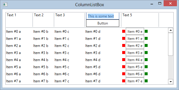
Similarly, each and every cell can have an item template. The above screen shot shows such a template in column 5. The following code was used to create that column:
<c:ListColumn Header="Text 5" IsResizable="True" Width="200">
  <c:ListColumn.ItemTemplate>
    <DataTemplate>
      <StackPanel Orientation="Horizontal" HorizontalAlignment="Stretch">
        <Rectangle Fill="Red" Height="10" Width="10" Margin="2"/>
        <TextBox Text="{Binding Text5}"/>
        <Rectangle Fill="Green" Height="10" Width="10" Margin="2"/>
      </StackPanel>
    </DataTemplate>
  </c:ListColumn.ItemTemplate>
</c:ListColumn>
Using this technique, the developer has full freedom over the content of these UI elements. All standard UI techniques (including all interactivity WPF supports as well as techniques such as databinding) are fair game.
Another interesting technique for column headers is the ability to associate a click command for header clicks. This way, a command can be fired whenever the user clicks a header (in many cases, this is used to perform sorting operations). The click command is wired up to a column like so:
<c:ListColumn BindingPath="Text1" Header="Text 1" HeaderClickCommandBindingPath="HeaderClick" />
This binds a command property called “HeaderClick” (which has to be of type ICommand and is usually a ViewAction) to the click of the header. Note that the command receives a HeaderClickCommandParameters object as its command parameter, which provides information about the clicked column. It is thus often possible to wire a single click command up to all column headers and determine in the Execute of the command, which column was clicked and what to do in response. (Note: Header click commands only fire on non-templated headers. For headers with a template, commands have to be wired up to the template itself using standard techniques, such as the ones described in Generic ability to hook all events as commands).
Note: Binding the command has to be done using a path expression rather than “{Binding HeaderClick}” syntax, because the column definitions are just used to populate the columns that are ultimately used in the visual tree. However, the column definitions themselves do not partake in the UI's data context and can thus not be bound using binding extension syntax. This is an effect commonly seen in complex UI controls. Also note that header clicks can only be handled via bound commands from a view model. Headers do not fire equivalent events. This is due to the column definitions being done very abstract. The actual objects used to display headers can vary greatly in different themes or styles. Thus the developer does not have access to the actual objects that would be needed to wire up events.
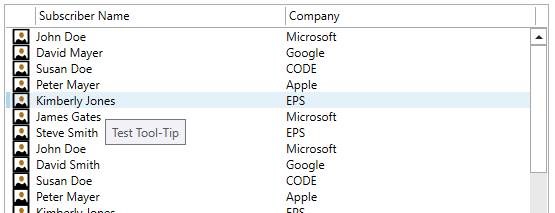
It is also possible to create tool-tips for the contents of a column. This can be done by either hard-coding a tool-tip, or by setting a binding path, like this:
<Controls:ListColumnsCollection>
  <Controls:ListColumn Width="30" IsResizable="False" BindingPath="Image1" />
  <Controls:ListColumn Width="250" IsResizable="True" BindingPath="Text1" Header="Subscriber Name" ToolTip="Test Tool-Tip" />
  <Controls:ListColumn Width="250" IsResizable="True" BindingPath="Text2" Header="Company" ToolTipBindingPath="Text2" />
</Controls:ListColumnsCollection>
The result looks like this:
You can use the same feature in your own listboxes as well if you do not want to use the CODE Framework styles. To do so, create a style and copy a few of the CODE Framework helper objects into your style to take care of the most difficult parts automatically. We recommend you take a look at the default styles that ship with the framework to get started (take a look at the listbox XAML resource dictionaries in both Battleship and Metro styles).
Sorting and Filtering
Another cool feature for multi-column lists is the ability to sort and filter by column fully automatically.
For sorting to work, one can simply use the AutoSort property of the column definitions:
<ListBox Style="{DynamicResource SearchListStyle}">
  <controls:ListEx.Columns>
    <controls:ListColumnsCollection>
      <controls:ListColumn BindingPath="Text1" AutoSort="True" SortOrder="Ascending" Header="Item #" />
      <controls:ListColumn BindingPath="Text2" AutoSort="True" Header="Pack Size" />
      <controls:ListColumn BindingPath="Text3" AutoSort="True" Header="Description" />
    </controls:ListColumnsCollection>
  </controls:ListEx.Columns>
All the columns that have “AutoSort” set to true now support sorting (thus this can be enabled on a column-by-column basis). Setting a SortOrder on a column makes that the default sort (this should only be done on one column). Here’s the result:
In this example, the user has clicked on the “Description” header twice to sort by that column in descending order.
Note: This simply performs a default sort. This does not interfere with the ability to implement manual sorting by showing a sort-indicator in the header and wiring up an associated command/view-action that simply indicates to the view-model to re-order the data. That approach is more complex, but allows for complex and customized sorting scenarios.
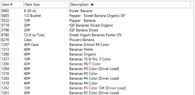
Filtering works in a very similar fashion. This screen-shot shows the same list with filter fields visible in the headers:
The important part here is in the header above “Description”. I simply typed a filter term into that textbox and the list got filtered down to that sub-set.
There are a few interesting details here: For one, note that all the columns have a filter textbox (with a nice watermark text with instructions). This is optional. Each column can turn the filter on and off individually. Also note that there are visual indicators that tell the user that the column is filtered, such as the blue background in the header. There also is a “clear filter” icon that allows users to clear the filter without having to manually clear the textbox. (All of that is stylable of course, and you can make this look any way you want).
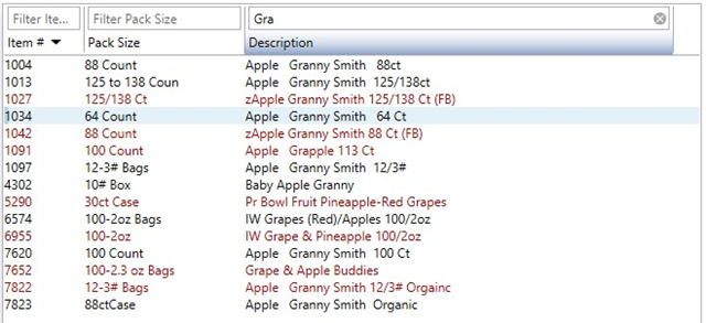
Here is an example of the same list with all three columns filtered:
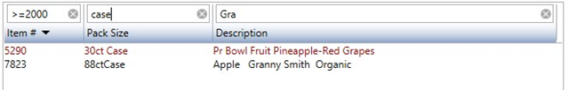
Again, there are a few interesting details. For one, how does it fundamentally work when there are multiple filter term? Are they combined with an AND operation? Or are they ORed together? Or should it be column-by-column with only one filter at a time? In this case, they actually perform an AND operation, but this behavior can be switched through the three scenarios by setting a property.
Another nifty detail is in the first column. Since that column is numeric, note that one can use terms such as “greater than” (supported are >, >=, =, <, and ⇐). Generally speaking, there are different options for filter behavior on a column-by-column basis. Numerics are different from strings, and strings can be exact matches, or “starts with” or “contains”. The last one is the default, but one can chance that.
Here is the source that defines this list (with non-filter related properties removed):
<ListBox>
  <controls:ListEx.Columns>
    <controls:ListColumnsCollection>
      <controls:ListColumn ... AutoFilter="True" FilterMode="Number" />
      <controls:ListColumn ... AutoFilter="True" />
      <controls:ListColumn ... AutoFilter="True" />
    </controls:ListColumnsCollection>
  </controls:ListEx.Columns>
The list itself can define the filter modus operandi. For instance, one can do this:
<ListBox c:ListEx.AutoFilterMode="AllColumnsOr">
This would change the mode from ANDing all column filters together and instead using an OR operation.
Whether or not the filter-controls show up in the first place depends on the ShowHeaderEditControls setting. If true, then the filter textboxes show up, if it is false, they are hidden, even if AutoFilter is set to true. Which is nice, because it means that these controls can be shown and hidden easily:
<ListBox c:ListEx.ShowHeaderEditControls="True">
Side-note: A nifty trick is setting these properties app-wide using a style like this, which means that they don’t have to be set on each control:
<Style TargetType="ListBox" BasedOn="{StaticResource {x:Type ListBox}}">
  <Setter Property="controls:ListEx.AutoFilterMode" Value="AllColumnsAnd" />
  <Setter Property="controls:ListEx.ShowHeaderEditControls" Value="{Binding Actions[ShowFilterHeaders].IsChecked}" />
</Style>
In this example, the default for all lists in the app is to use the AND-mode. Also, whether the filter-controls are shown or hidden depends on a toggle in the current view-model, allowing the user to easily toggle visibility of the filter controls.
To also add a few technical remarks: This type of filtering works on any enumerable data source. So there is no need for special filterable collections or anything like that. (The same goes for the sorting feature). When you query the ItemsSouce of the listbox, you will find that it is a list that only contains the items that match the filter and are sorted the way the sort-IU indicates. This makes everything very generic and means that anything else that goes along with the list still works unchanged.
We did quite a bit of work to make sure that performance of this is good, both in terms of raw performance and also in terms of user-perception. We are quite satisfied with the result. Note however that there are limits. While it won’t come to a crawl, users will probably start noticing a delay if there are thousands and thousands of items. The system is simply too generic, and imposes too few restrictions, to work well with huge amounts of data brought to the client. But then that’s not what we want to do anyway, right? 😉. It should work fine though with a few hundred or even a few thousand items.