Sticky Notes
Excerpt from an internal email at EPS:
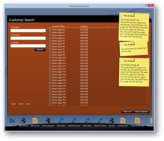
CODE Framework’s Wildcat theme supports notifications. What’s interesting is that the notifications are implemented as sticky notes (a popular feature of the Staff Lynx app the Wildcat theme is modeled after). It looks like this:

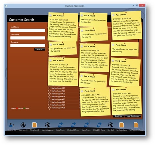
The sticky notes actually support some pretty wild features. They grow top-to bottom down the right side, and if there isn’t enough space vertically, they grow over to the left. We are putting some artificial limitations on this feature, but it could go to something like this if we wanted:

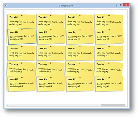
It is also interesting to know that there now is a StickyNotePanel class that can be used to lay out ListBoxes. Here’s a screen shot of such an example:

Note: It gets a bit odd, since the columns are aligned right-to-left (possibly a behavior that could be enhanced in the future and changed by means of a property). So right now this is probably used best for lists that are small enough to not scroll.
Doing this is relatively simple. Just use the new panel as the ItemsPanel as in this example:
<ListBox Margin="10" x:Name="list" ScrollViewer.VerticalScrollBarVisibility="Disabled">
   <ListBox.ItemsPanel>
     <ItemsPanelTemplate>
       <classes:StickyNotePanel />
     </ItemsPanelTemplate>
   </ListBox.ItemsPanel>
Note that the panel doesn’t actually make the yellow background (that is simply a color I assigned to each template in this example), but the panel arranges each item and gives it a slightly crooked alignment as one would expect for sticky notes.
