Progress Animations
Progress Ring/ Circular Progress Animation
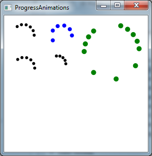
Our WPF modules of CODE Framework feature a circular progress animation that looks much like the Windows 8 progress ring. Here are a few examples:

Progress Rings
This has been supported for a while, actually. In fact, this has been supported since before the WinRT SDK was available. This is simply a control found in the Metro namespace (CODE.Framework.Wpf.Theme.Metro.dll). This control was originally called CircularProgressAnimation, and it’s still available under that name. WinRT on the other hand calls this control ProgressRing. For compatibility, we are now also making this available as a ProgressRing class (it’s a straight subclass of CircularProgressAnimation).
Using the control is relatively easy and works the same way as in WinRT. Put the control on a form, set Visibility = Visible and set IsActive = true, and there it goes!
Our version supports quite a few additional settings. In particular, you can change how many dots there are, how fast they rotate, how far they are spaced apart, what color they are, and how big they are. All these properties are named DotXxx. DotCount, DotDiameter, DotSpaceFactor, and so on.
Here's the code that was used to create the above example:
<Controls:ProgressRing IsActive="True" Height="48" Width="48" Margin="12,12,218,202"/>
<Controls:ProgressRing IsActive="True" DotCount="6" DotDiameter="8" DotBrush="Blue" Height="48" Margin="87,12,143,201" Width="48" DotSpaceFactor="1.5"/>
<Controls:ProgressRing IsActive="True" DotCount="6" Height="48" Margin="13,76,217,137" Width="48"/>
<Controls:ProgressRing IsActive="True" DotCount="5"  Margin="87,76,158,154" />
<Controls:ProgressRing IsActive="True" DotBrush="Green" DotCount="12" DotDiameter="10" DotSpaceFactor="0.8" Margin="152,12,12,137" DotAnimationSpeedFactor="1.25" />
Linear Progress Animation
Similar to the circular progress animation, we also support a Metro-style linear animation. It’s a bit difficult to see in a still screen shot, but here is an example that shows 3 of them in progress:

The overall properties available are practically identical to the circular version. Here is the XAML that defines the 3 animations shown above:
<Controls:LinearProgressAnimation VerticalAlignment="Bottom" Margin="0,0,0,10" IsActive="True" />
<Controls:LinearProgressAnimation VerticalAlignment="Bottom" Margin="0,0,0,30" IsActive="True" DotBrush="Teal" DotDiameter="12" />
<Controls:LinearProgressAnimation VerticalAlignment="Bottom" Margin="0,0,0,50" IsActive="True" DotBrush="Green" DotDiameter="10" DotCount="7" />
Note that linear progress animations do not look good below a certain width. It probably shouldn’t be used below a width of 400 or 500 pixels.
